Preview image. Unlock full-res
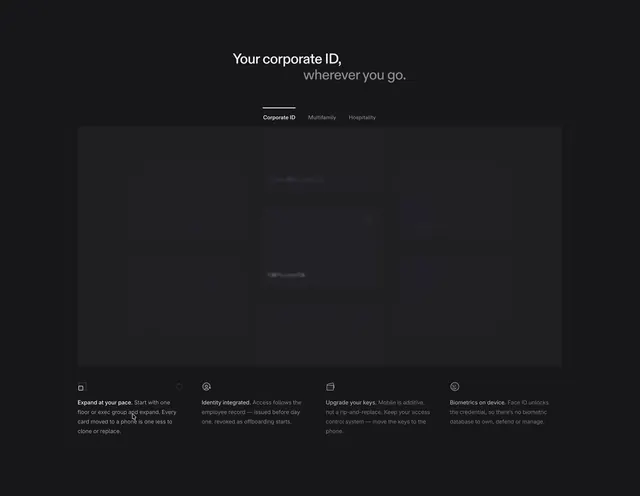
A dark, minimal landing page for a corporate digital identity and access control product, showcasing a physical card credential UI with employee profile cycling and feature callouts.
More like this
See all

Summary
A dark, minimal landing page for a corporate digital identity and access control product, showcasing a physical card credential UI with employee profile cycling and feature callouts.
Visual description
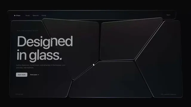
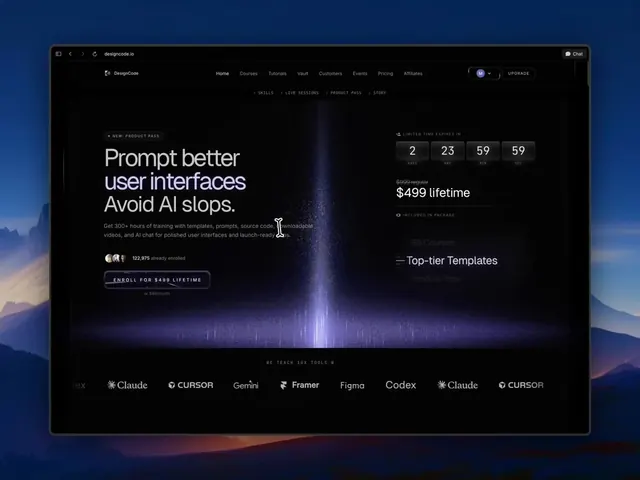
A near-black landing page with a centered two-tone headline, the first line in white and the second in muted grey, followed by a small three-item tab row with an underline on the active tab. A large, almost invisible dark panel holds blurred card mockups in a staggered grid, appearing mid-transition. Below, four columns each have a tiny outline icon and a short bold lead-in followed by grey descriptive text.
Key takeaway
Use a two-tone headline and a dim, blurred transitional preview panel over dark grey, with a quiet four-column icon row underneath, to keep the page restrained and premium.
Reuse notes
Reach for this as a ui screen reference. Pairs with minimal, clean directions. Original by James McDonald.