Preview image. Unlock full-res
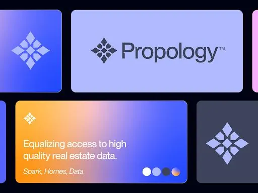
Product card system with bold blue-to-orange gradients, geometric diamond icons, and multi-card grid layout showcasing a real-estate data platform.
Summary
A grid of branded product cards for Propology, a real-estate data platform, using periwinkle-to-blue gradients paired with warm orange accents and geometric diamond-shaped icons.
Visual description
Four rounded-corner cards in a 2x2 grid against a dark background. Top left: solid cobalt blue card with a white diamond-star icon centered. Top right: lavender-light card with the gray "Propology" wordmark and trademark symbol. Bottom left: a large hero card with blue-to-orange vertical gradient, white diamond icon, tagline "Equalizing access to high quality real estate data" in white sans-serif, secondary text "Spark, Homes, Data" in italics, and three colored dot indicators (white, light-purple, orange) at the bottom right. Bottom right: charcoal card with a light-purple diamond icon. Overall layout emphasizes geometric consistency and color harmony through complementary warm-cool pairing.
Key takeaway
The two-tone gradient card (blue bottom-left to orange bottom-right) creates visual depth without complexity. The repeated geometric icon system (diamond-star) creates brand coherence across all four cards. Using dots as neutral accent indicators and call-to-action anchors is clean and scalable.
Reuse notes
Strong for SaaS or fintech dashboards. The periwinkle-blue base reads as trustworthy and technical; the orange accent prevents coldness. Works best when the gradient card is the hero (largest or most prominent). Avoid if the brand needs warmth or friendliness without technical association.