Preview image. Unlock full-res
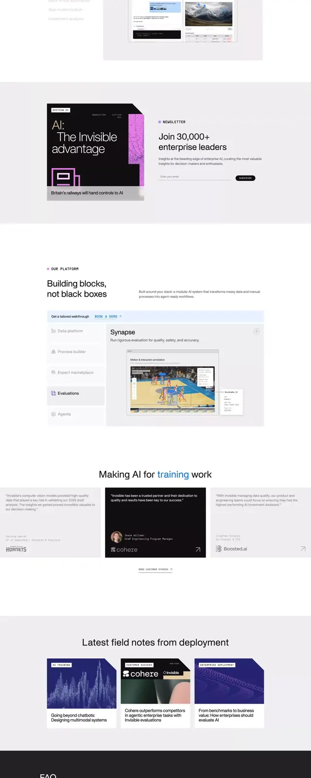
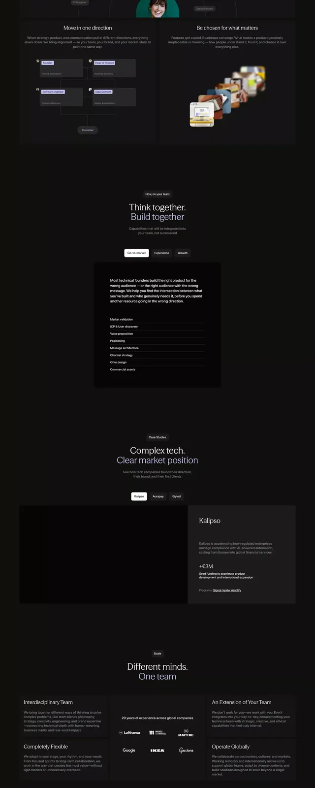
Long-form B2B marketplace landing page in dark mode with pale purple accents, organized as a series of stacked sections describing product benefits and integrations.
Summary
A tall, scrollable B2B marketplace landing page in dark mode with minimal typography and stacked section cards highlighting team collaboration features, integrations, and platform benefits, anchored by a pale purple accent color.
Visual description
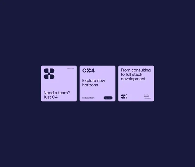
Black background (#110E0F) with generous whitespace between sections. Pale purple accent color (#C6C3F4) used sparingly on headings and UI elements. Clean, light-gray body copy (sans-serif) for descriptions. Series of alternating section cards: some feature left-aligned text blocks paired with mockup imagery (product screenshots, integration icons, team illustrations); others use full-width layouts with centered text. Each section is clearly bounded with breathing room. No photographic imagery; geometric shapes, icons, and clean illustrations. Purple and white color palette maintained consistently throughout. Navigation and CTAs subtle, gray text on dark ground.
Key takeaway
The use of pale purple as a structural accent (not noise) against a very dark background, making it work in both headings and interactive elements. The rhythm of content sections with clear visual breaks and left-aligned text that reads quickly. Minimal color palette forcing hierarchy through typography size and weight rather than decoration.
Reuse notes
Strong for B2B SaaS marketplace, collaboration, or developer platform landing pages that need to convey complexity without visual clutter. The dark + purple combination reads premium and technical. Pairs well with case studies, testimonial cards, or integration walls. Less effective for consumer or emotional narratives.