Preview image. Unlock full-res
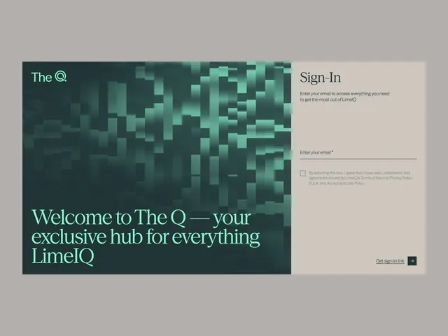
Split-screen sign-in pairing a busy abstract texture in dark teal-green on the left with a minimal beige form panel on the right, using mint-green serif type for the headline.
Summary
A high-contrast split-panel authentication screen balancing visual texture (abstract organic pattern, dark teal-left side) with minimal form clarity (beige right panel, email input, checkbox, call-to-action button).
Visual description
Left half: a busy, pixelated abstract pattern in shades of dark teal and mint-green creating depth and movement across the vertical half. Floating at the top-left, "The Q" logotype in mint-green sans-serif sits above a large serif headline in the same mint tone reading "Welcome to The Q — your exclusive hub for everything LimeIQ" (four lines, flush left). Right half: a solid off-white/beige panel containing "Sign-In" in dark serif type, a one-sentence descriptive tagline (small sans-serif), an email input field ("Enter your email *"), a checkbox acknowledging terms, and a "Get sign-in link" button (dark with arrow) anchored at bottom-right. Clean, minimal whitespace between elements.
Key takeaway
The textured-vs-clear left-right split instantly signals "brand expression on left, functional form on right" without competing for attention. The serif display type on the visual side (contrasting the form's sans-serif) adds personality. High contrast between the busy abstract pattern and the silent form ensures both are readable and distinct.
Reuse notes
Ideal for B2B SaaS and fintech login flows where brand personality matters but form completion cannot be obscured. The split layout naturally accommodates a wide desktop viewport; scales awkwardly on mobile (test stacked version). Works best when the left texture is genuinely interesting or brand-specific; a generic gradient would lose the appeal.