Preview image. Unlock full-res
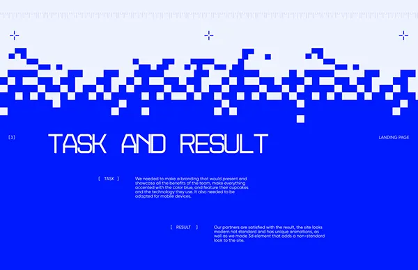
Abstract high-contrast interface using a pixelated blue-and-white wave and geometric color blocking to separate task input from results, optimizing for clarity and visual structure over skeuomorphism.
Summary
An abstract UI concept using a stark blue-white palette and pixelated wave shape to divide task input from result output, emphasizing structure and clarity over conventional app chrome.
Visual description
A horizontal composition on a light grey background. The right two-thirds is a bright royal-blue field filling most of the frame. At the top of this blue area, a pixelated wave (a digital/8-bit style border) separates it from a light lavender band at the very top. Within the blue section, large white sans-serif letters spell "TASK AND RESULT". Below, two narrow text columns (left and right) hold small body copy describing the task and the result in muted tones. The left one-third of the composition remains light lavender-white, untouched, acting as negative space. Small plus (+) symbols sit at cardinal positions, adding a minimal navigational or orientation cue. The overall mood is clean, technical, and structured; color and geometry do all the communicative work.
Key takeaway
The pixelated wave is a distinctive boundary marker that feels both retro and contemporary, adding personality to an otherwise austere interface. The 2:1 blue-to-neutral space split creates visual weight without clutter. All-caps sans-serif type set large keeps hierarchy obvious even when detail is sparse.
Reuse notes
Works well for process-driven tools (input-to-output workflows), data visualization, or concept mockups where the structure matters more than rich graphics. The bold blue-white combo risks being cold; pair with warmer supporting colors if aiming for friendliness. The pixelated wave is a strong signature; use it sparingly across a suite or it loses impact.