Preview image. Unlock full-res
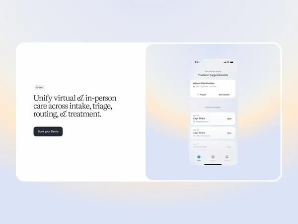
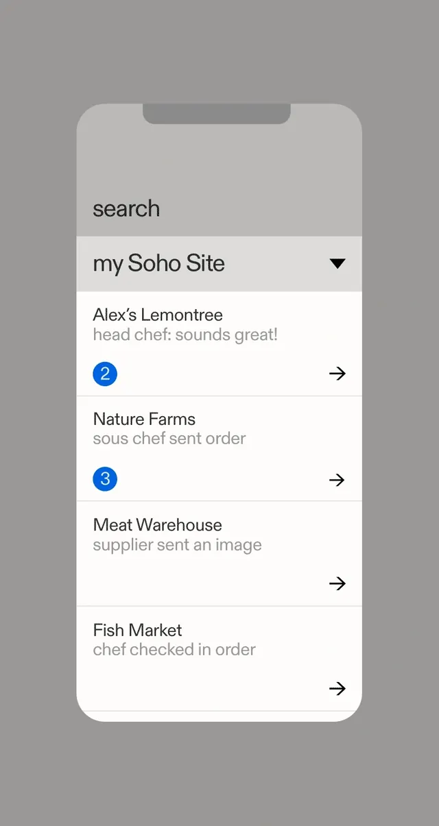
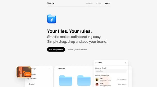
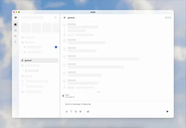
A clean UI study of button states, spacing, and text rendering with subtle hover feedback on a minimal white canvas.
Summary
A clean UI study of button states, spacing, and text rendering with subtle hover feedback on a minimal white canvas.
Visual description
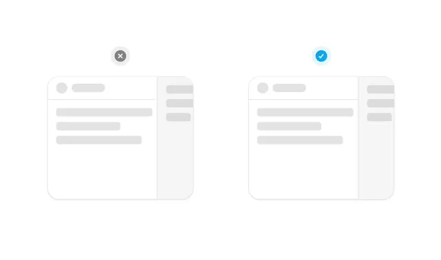
Two identical side-by-side UI wireframes featuring rounded rectangular containers with light gray placeholder blocks for text and images. A small circular icon sits centered above each container, one containing a gray X and the other a blue checkmark. The color palette is monochromatic white and light gray with a single blue accent.
Key takeaway
Use simplified, low-fidelity skeleton screens to communicate state changes or validation results without distracting from the layout.
Reuse notes
Reach for this as a ui screen reference. Pairs with typographic, minimal directions. Original by Jakub Krehel.