Preview image. Unlock full-res
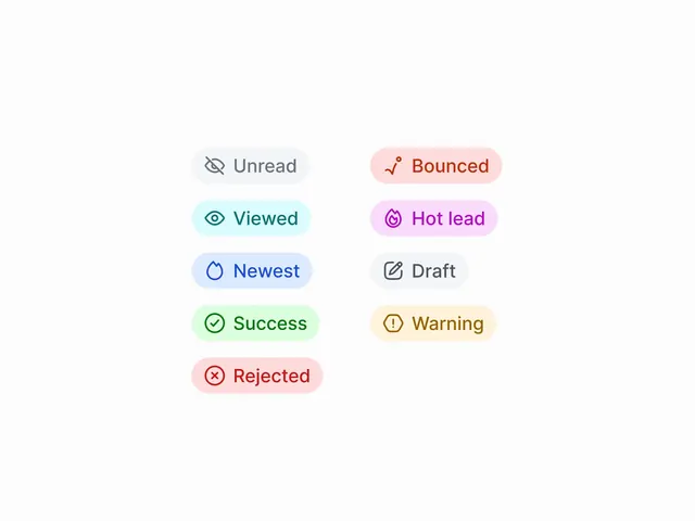
A clean set of status badge chips with semantic color coding and icons, covering states like Success, Rejected, Bounced, Hot lead, and Warning on a minimal light background.
More like this
See all
Summary
A clean set of status badge chips with semantic color coding and icons, covering states like Success, Rejected, Bounced, Hot lead, and Warning on a minimal light background.
Visual description
Nine semantic status badges arranged on a light background, each pairing a simple icon with a colored pill-shaped container and label text. Unread and Draft appear in gray, Success in green, Bounced and Rejected in red/salmon tones, Viewed in cyan, Hot lead in pink, Newest in blue, and Warning in yellow. Icons maintain consistent weight across all states.
Key takeaway
Build a modular badge library with semantic color coding for each state - greens for success, reds for errors, blues for neutral - creating a reusable system that signals product status consistently across any interface.
Reuse notes
Reach for this as a ui screen reference. Pairs with minimal, clean directions. Original by harshad.