Preview image. Unlock full-res
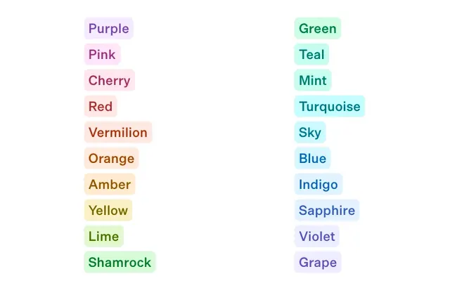
A balanced set of pastel color badge components spanning warm and cool hues, from Cherry and Vermilion to Teal and Sapphire, each pill tinted to match its named color.
More like this
See all

Summary
A balanced set of pastel color badge components spanning warm and cool hues, from Cherry and Vermilion to Teal and Sapphire, each pill tinted to match its named color.
Visual description
A systematic display of pastel color badges arranged in two vertical columns on white. Each pill-shaped badge contains a color name in text colored to coordinate with its background. The left column progresses from cool purples and pinks through warm reds and oranges to yellows and greens. The right column mirrors cool greens and teals into blues and purples. All badges maintain consistent rounded-pill geometry and moderate saturation, creating a cohesive palette reference.
Key takeaway
Create a color badge system where label text color coordinates with the background, turning each badge into a legible swatch and reference tool simultaneously. The two-column warm-to-cool progression makes the palette feel complete and thoughtfully organized.
Reuse notes
Reach for this as a ui screen reference. Pairs with minimal, clean directions. Original by Colm Tuite.