Preview image. Unlock full-res
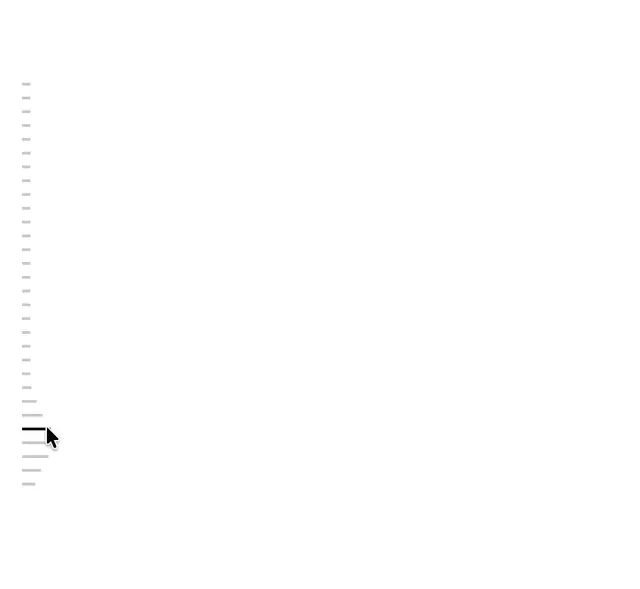
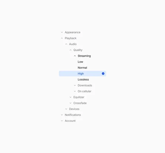
A nested collapsible tree UI component for settings navigation, shown with spacing guides to refine alignment and hierarchy across multiple depth levels.
More like this
See all

Summary
A nested collapsible tree UI component for settings navigation, shown with spacing guides to refine alignment and hierarchy across multiple depth levels.
Visual description
Hierarchical settings tree on a light background showing multi-level nesting and collapse toggles. Top-level sections like Appearance and Playback stack vertically with chevron indicators. Quality expands to reveal Streaming submenu with nested options including Low, Normal, High (selected with blue highlight and checkmark), and Lossless. Indentation depth signals parent-child relationships without visual dividers or icons.
Key takeaway
Rely on indentation depth and subtle background highlighting to convey hierarchy in nested navigation, avoiding icon clutter and creating a text-focused information architecture that remains scannable at any depth.
Reuse notes
Reach for this as a ui screen reference. Pairs with minimal, clean directions. Original by Aabis.