Preview image. Unlock full-res
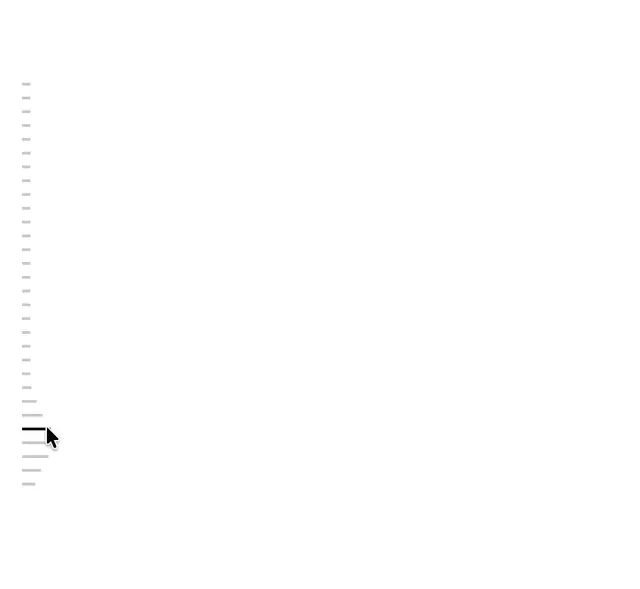
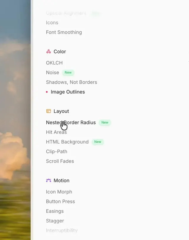
A screen recording of a design reference app with categorized sections covering typography, color, layout, and motion, showing hover and selection microinteractions on each list item.
More like this
See all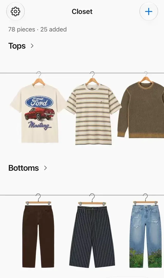
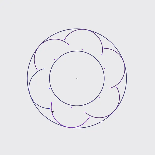
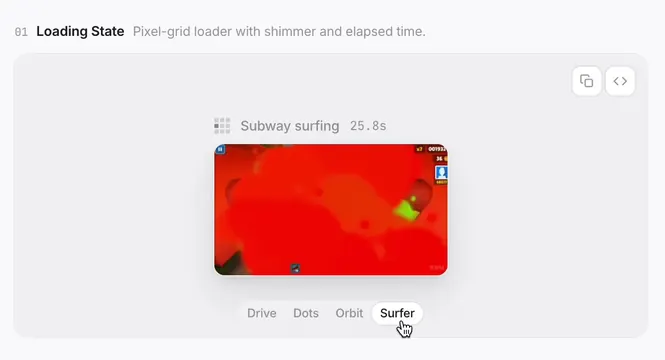
Summary
A screen recording of a design reference app with categorized sections covering typography, color, layout, and motion, showing hover and selection microinteractions on each list item.
Visual description
A tall cropped view of a light sidebar listing guideline topics, grouped under small icon headings for Color, Layout and Motion in pink, orange and purple. Items are plain gray text lines with spacious vertical rhythm, a few carry small green New pills, and one item has a pink dot with darker text to show the active state. A hand cursor hovers over the Nested Border Radius row, and the text fades out at the top and bottom edges. A blurred warm landscape photo with clouds shows on the far left behind a thin vertical divider.
Key takeaway
Mark the selected row in a long list with a small accent dot and darker text instead of a filled background, and fade the list edges so it feels calm and scrollable.
Reuse notes
Reach for this as a ui screen reference. Pairs with minimal, clean directions. Original by Gustavo.