Preview image. Unlock full-res
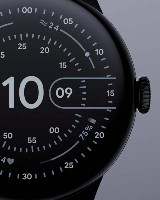
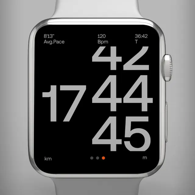
Product shot of an Apple Watch showing a dark monochrome running screen with oversized pace numerals and an orange page dot.
Summary
Product shot of an Apple Watch showing a dark monochrome running screen with oversized pace numerals and an orange page dot.
Visual description
Silver Apple Watch with white sport band on a light gray gradient background. The black screen shows small white stats across the top (average pace, heart rate, elapsed time). The center is dominated by large light-gray numerals in a vertical stack suggesting a scrolling pace readout. km and m unit labels sit at the bottom with a three-dot pager where the active dot is orange.
Key takeaway
Extreme type scale for the primary metric while secondary stats stay whisper-small. One accent color on a pager dot is enough to signal interactivity on an otherwise monochrome face.
Reuse notes
Reference for wearable UI, fitness apps, or hardware hero shots. Works when one hero number must read at arm's length.