Preview image. Unlock full-res
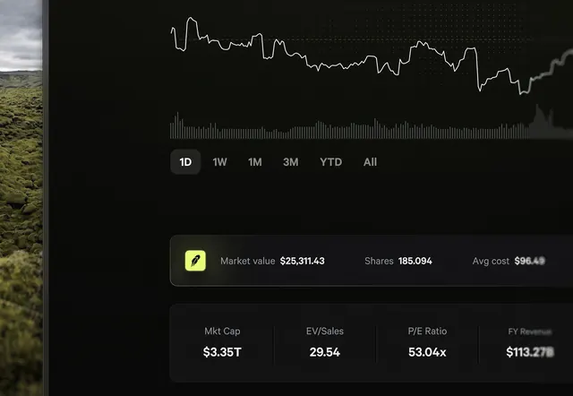
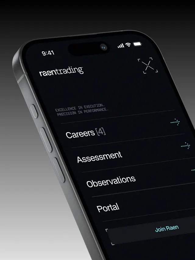
Mobile trading app interface with pure-black background, high-contrast sans-serif typography, and sparse list navigation linking to features like Careers, Assessment, Observations, and Portal.
Summary
A financial trading app's menu screen on pure black with "Raen trading" branding, clean sans-serif typography, and a sparse vertical navigation list.
Visual description
The phone screen shows an all-black background with the "raen trading" wordmark below the time and status icons. Mid-screen, the tagline "EXCELLENCE IN EXECUTION. PRECISION IN PERFORMANCE." appears in small gray caps. Below that, a list of four link items stacked vertically: "Careers [4]", "Assessment", "Observations", and "Portal". A teal-colored "Join Raen" call-to-action button anchors the bottom. White sans-serif body text for labels and navigation; the wordmark uses a lighter weight. The entire composition emphasizes white-on-black contrast with minimal visual noise.
Key takeaway
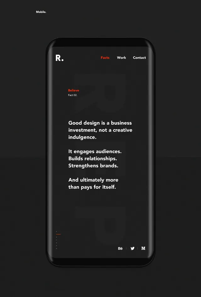
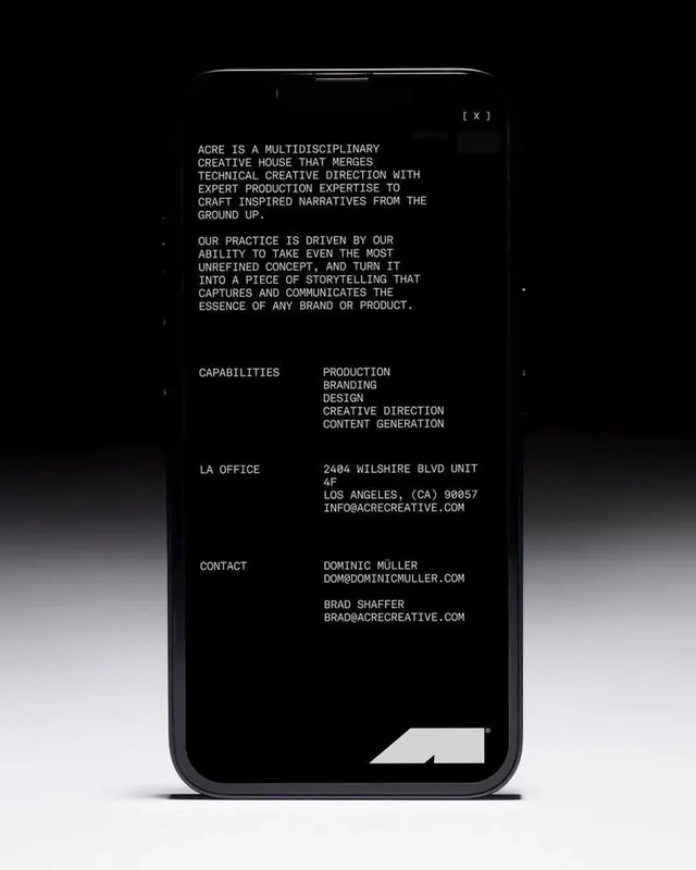
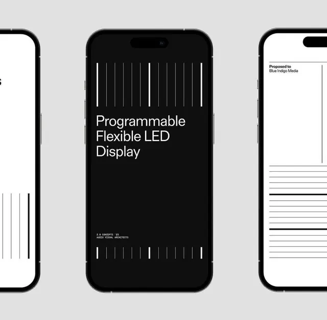
The strategy of combining monochromatic contrast (white text on true black) with sparse, list-based navigation for clarity. The small accent color (teal) draws focus only where needed. The tagline treatment in all-caps gray creates visual hierarchy without adding clutter.
Reuse notes
Works well for fintech or high-focus platforms where clarity and premium aesthetic matter more than visual richness. Pairs well with technical, data-heavy interfaces. Avoid on applications needing friendly or playful tone.