Preview image. Unlock full-res
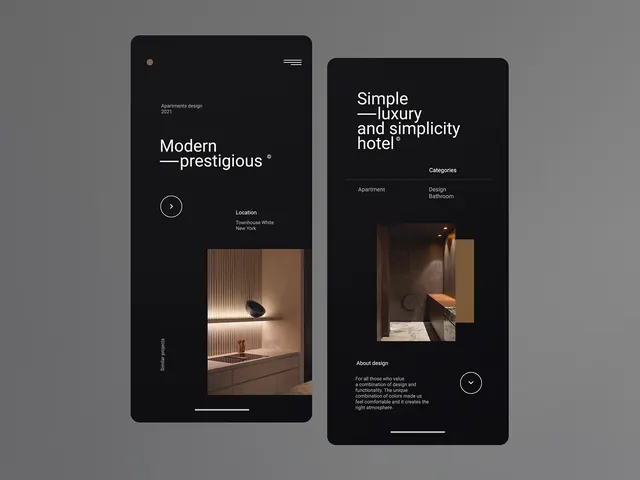
Two dark mobile UI concept screens are shown side by side on a gray background with large white typography and embedded interior photography.
Summary
Two dark mobile UI concept screens are shown side by side on a gray background with large white typography and embedded interior photography.
Visual description
The image shows two tall rounded-rectangle mobile screens on a neutral gray backdrop. Each screen uses a black background, large white headline text, small supporting labels, circular arrow buttons, and a photo of a warm-toned interior space placed in the lower half.
Key takeaway
Use oversized, tightly tracked headline typography against a deep black canvas, then offset it with a single warm photographic focal point. The result feels premium by combining lots of negative space with one strong material image and a few restrained UI controls.
Reuse notes
Reach for this when designing a high-end landing page, property, hospitality, or portfolio concept that needs to feel editorial and modern. It works best when the content is sparse and the imagery can carry most of the visual weight.