Preview image. Unlock full-res
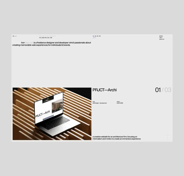
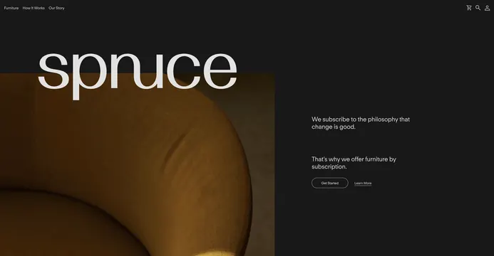
Dark minimalist website hero showing "spruce" heading with a warm wood-tone product image on the left and philosophical tagline on the right, promoting subscription furniture model.
Summary
A luxury furniture brand's website hero featuring a split layout with warm wood-toned product imagery on the left and "spruce" branding with marketing copy on the right, all on a dark brown-black background.
Visual description
Wide horizontal layout on very dark brown background (near black). Left half shows a cropped warm wood-toned product image (possibly furniture). Right half displays "spruce" in large light sans-serif type at top with navigation menu above. Below the brand name, descriptive copy reads "We subscribe to the philosophy that change is good" and "That's why we offer furniture by subscription," followed by "Get Started" and "Learn More" button links. Text is in light cream against dark background. Overall aesthetic is refined, minimal, and luxury-focused.
Key takeaway
The split image-and-copy layout uses dark backgrounds and warm wood tones to evoke quality, sustainability, and thoughtful design. Light typography creates high contrast and readability.
Reuse notes
Strong template for furniture, home goods, or sustainability-focused brands. The dark background conveys luxury and premium positioning. The subscription-model messaging can be adapted for other service-based design products. Wide horizontal format suits desktop and large-screen contexts.