Preview image. Unlock full-res
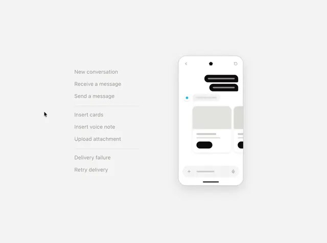
A walkthrough of a state machine diagram for a messaging app, showing how selecting each named state updates a wireframe phone mockup to reflect the corresponding UI.
More like this
See all

Summary
A walkthrough of a state machine diagram for a messaging app, showing how selecting each named state updates a wireframe phone mockup to reflect the corresponding UI.
Visual description
Two-column layout with labeled states on the left in gray text (New conversation, Receive a message, Send a message, Insert cards, etc.) paired with an iPhone mockup on the right displaying the corresponding messaging UI. Black message bubbles, blue online indicator, and input field visually update as each state is selected, making the state machine tangible.
Key takeaway
Pair a state machine diagram with live UI mockups showing how each state manifests on screen, making the relationship between business logic and visual design explicit and testable.
Reuse notes
Reach for this as a ui screen reference. Pairs with minimal, clean directions. Original by joshpuckett.