Preview image. Unlock full-res
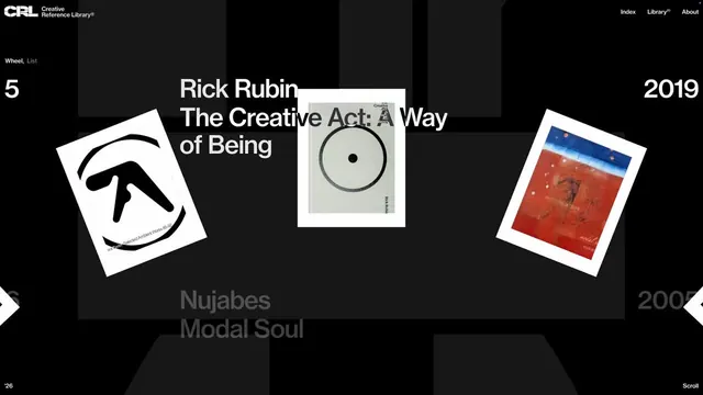
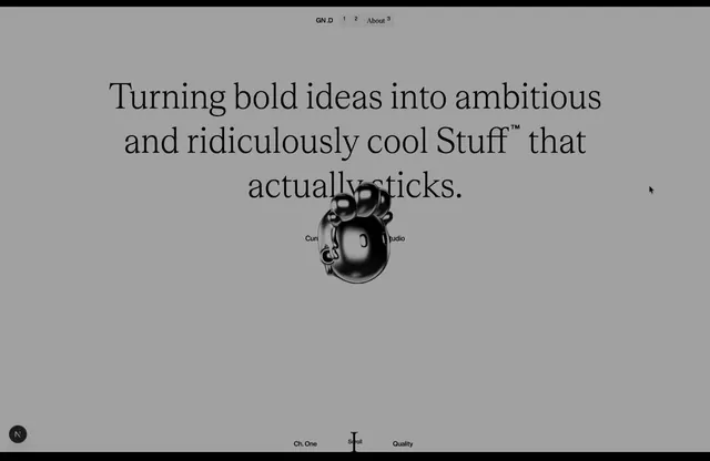
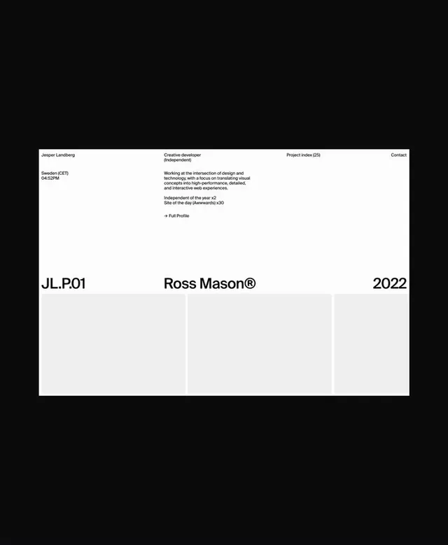
A stark black and white portfolio website uses oversized typography and a sparse grid to present projects with an editorial feel.
Summary
A stark black and white portfolio website uses oversized typography and a sparse grid to present projects with an editorial feel.
Visual description
A minimalist UI screen featuring a white background with black sans-serif typography. The layout is divided by thin horizontal and vertical rules into a strict grid, with a header containing navigation links and a main body section. Large, bold text reading "JL.P.01", "Ross Mason®", and "2022" anchors the center of the composition.
Key takeaway
Use a rigid, thin-line grid system to organize disparate blocks of text and create a structured, architectural feel.
Reuse notes
Reach for this as a ui screen reference. Pairs with typographic, minimal directions. Original by Gil Huybrecht.