Preview image. Unlock full-res
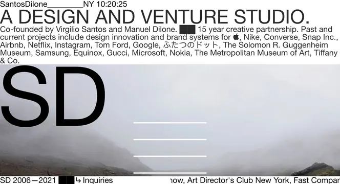
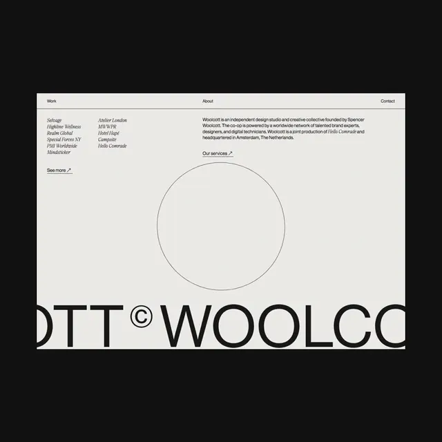
A seven-slide website redesign showcase highlighting asymmetric layouts, micro-interactions, and the studio's custom typeface GD Gaio.

Summary
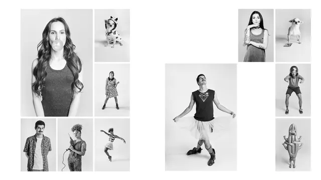
A seven-slide motion carousel showcasing Gärdedesign's studio website redesign, emphasizing digital interactions, asymmetric compositions, and their proprietary GD Gaio typeface. The design demonstrates modern web aesthetics applied to a design agency portfolio.
Visual description
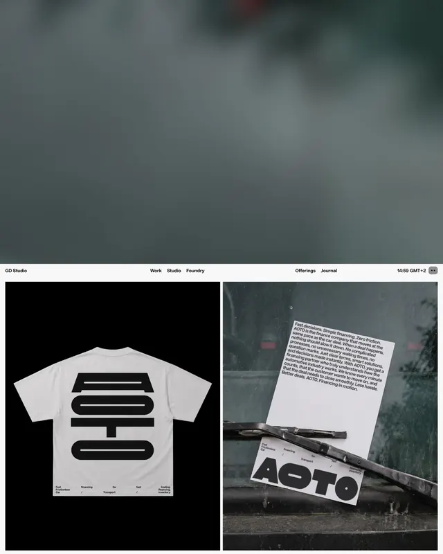
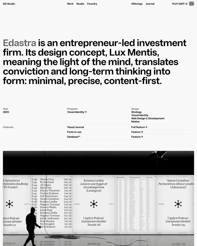
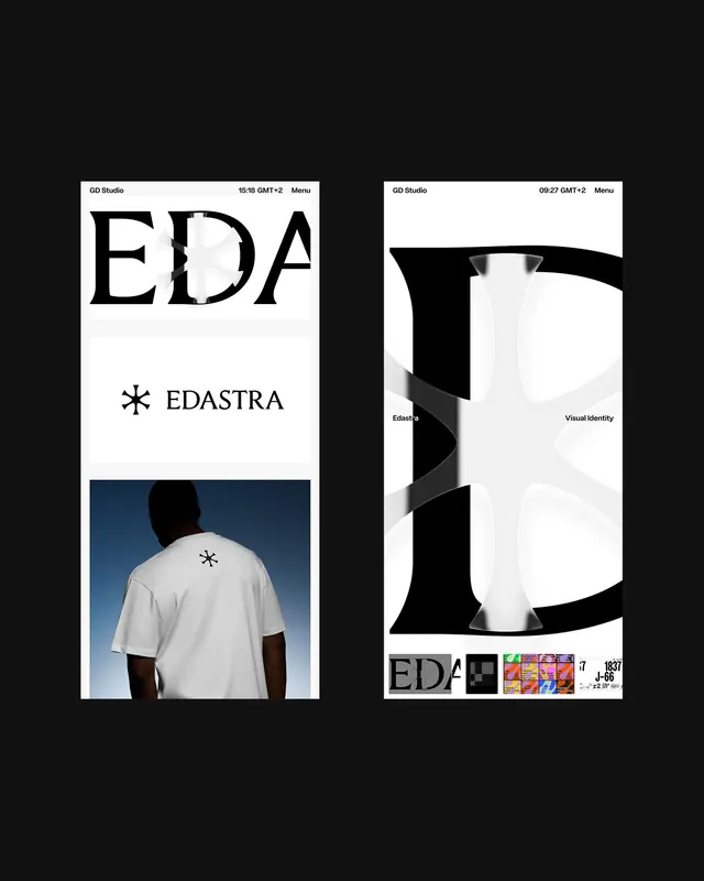
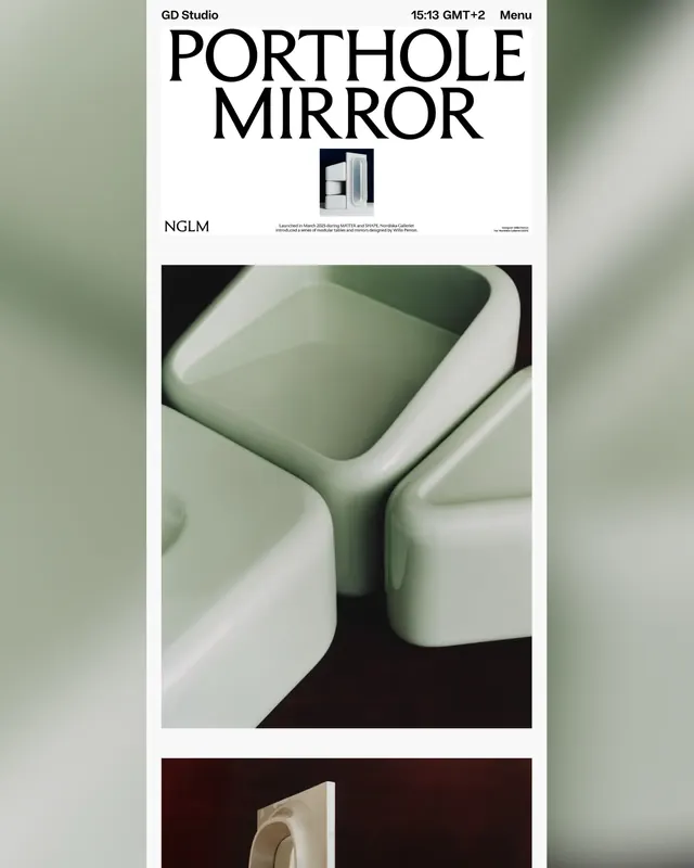
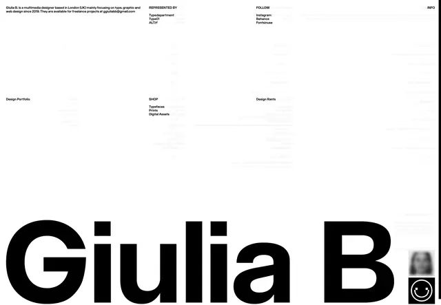
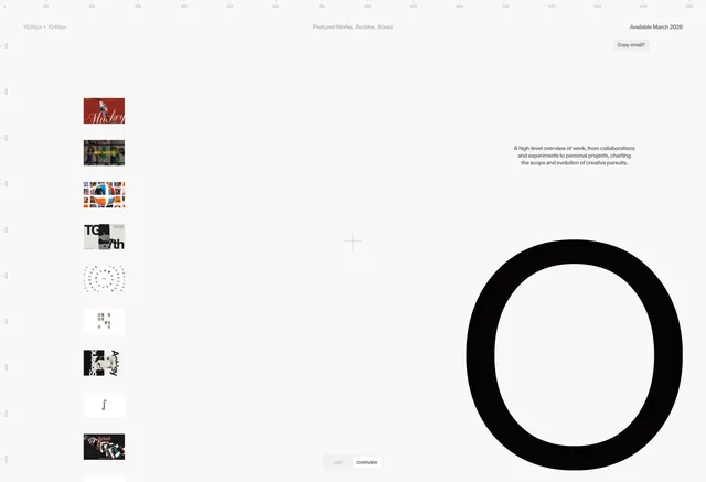
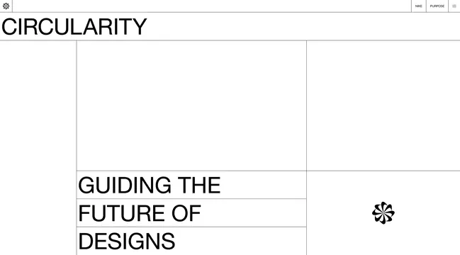
The carousel begins with a grid layout showing project case studies, each featuring clean typography headlines paired with project thumbnails and dates. Featured projects include tech companies, digital agencies, and design work. The design employs a light background with deliberate negative space, and images are arranged asymmetrically across spreads. Typography is the dominant visual element, with large sans-serif headlines balanced against smaller supporting text. Navigation elements and interactive components appear throughout, suggesting fluid micro-interactions. Colors remain neutral, with black text, white backgrounds, and gray accents. The custom GD Gaio typeface is showcased prominently, demonstrating its versatility across display and body text applications.
Key takeaway
Asymmetric layouts create visual interest without sacrificing legibility or professionalism. Custom typography becomes a key brand asset when consistently applied across the entire web experience. Whitespace and grid-breaking arrangements signal contemporary design thinking while maintaining readability.
Reuse notes
Strong reference for design agencies and creative studios showcasing their own work. The approach works well when the audience appreciates design-forward aesthetics and contemporary digital practices. Benefits from custom typography as a differentiator. Requires careful attention to whitespace and hierarchy to prevent the asymmetry from feeling chaotic.