Preview image. Unlock full-res
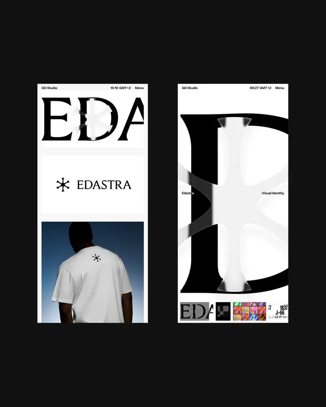
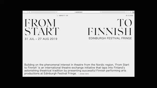
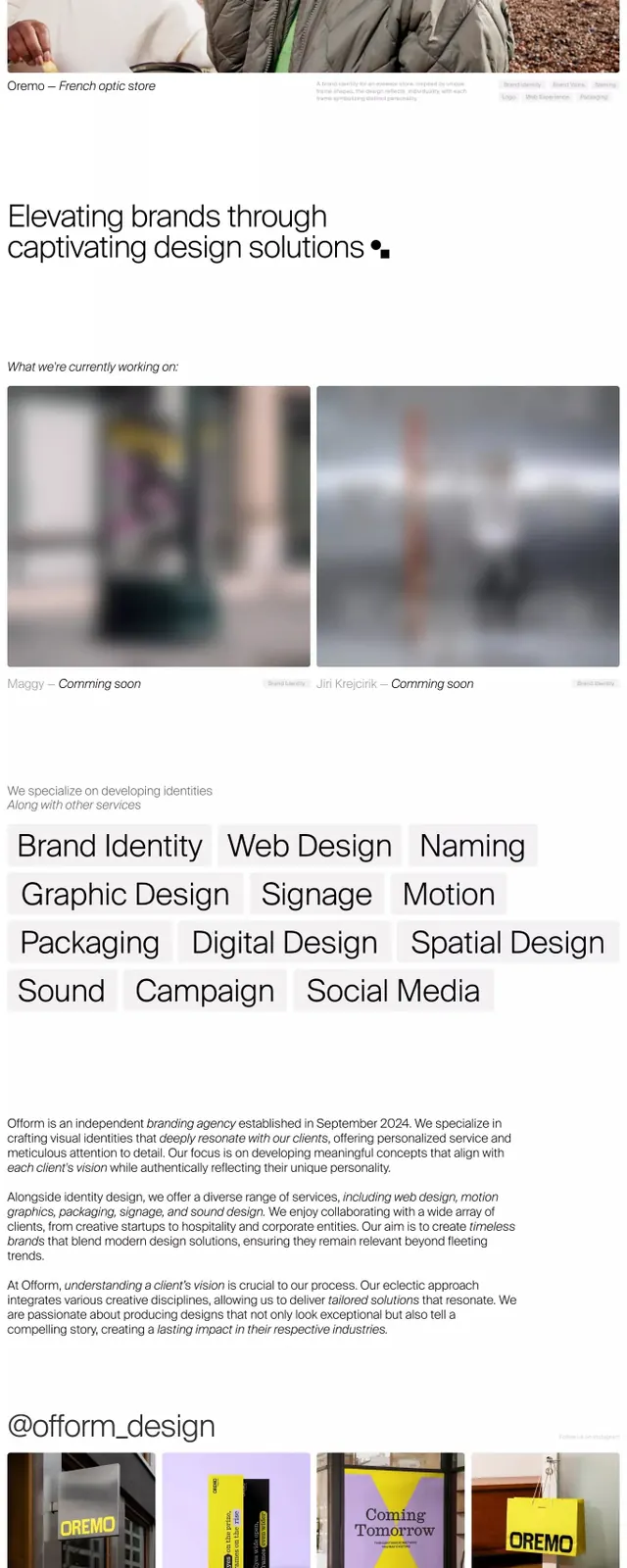
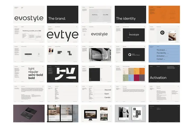
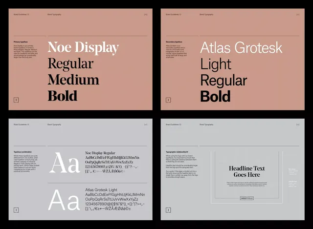
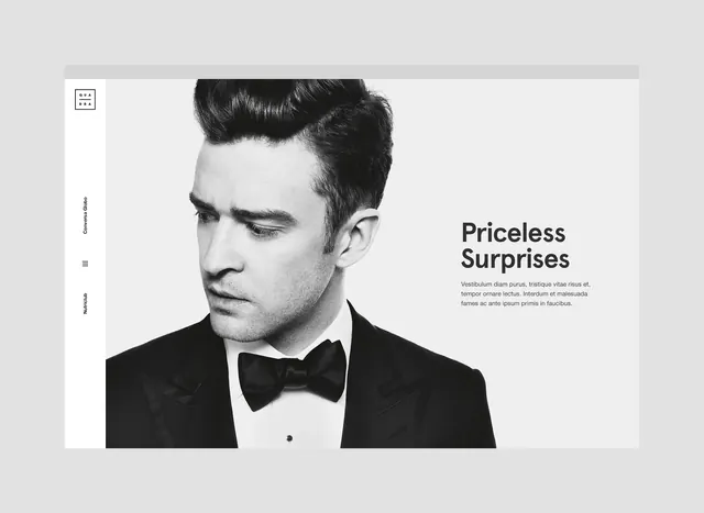
A clean, editorial magazine layout featuring bold typography, a striking photographic image, and plenty of white space creating a sophisticated, contemporary design.
Summary
A contemporary editorial or magazine layout combining bold, clean typography, a prominent photographic image, and generous white space to create a sophisticated, readable design.
Visual description
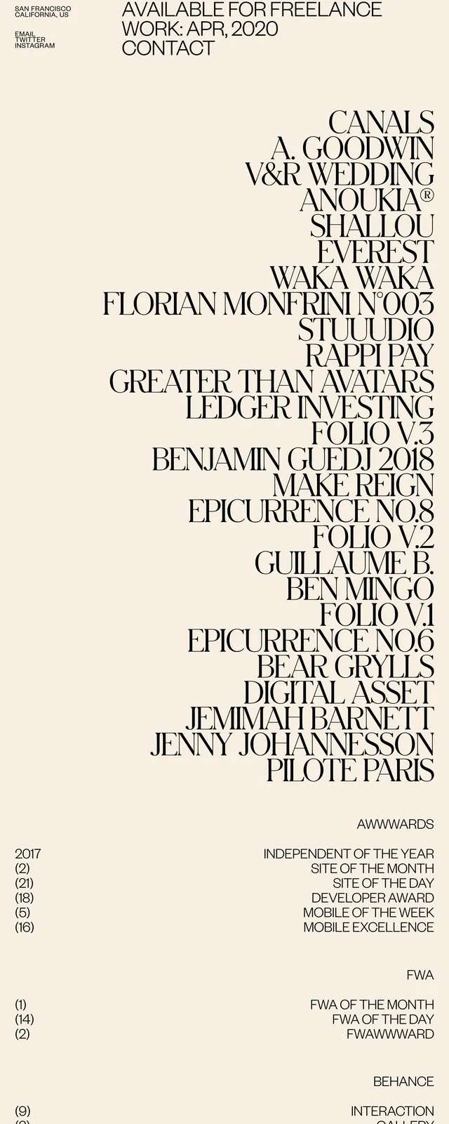
The layout uses a split or asymmetric composition. One side features a striking photograph—likely a portrait, product, or landscape image—with careful framing. The opposite side features bold sans-serif typography arranged in a clean, hierarchical hierarchy. Headline text is large and prominent, body text is smaller and easier to read. The color palette is minimal: black, white, grays, and warm neutrals. Generous margins and white space surround all elements, preventing the layout from feeling cluttered. A thin rule or subtle divider may separate sections. The overall effect is modern, readable, and refined.
Key takeaway
The generous use of white space makes complex information feel approachable and sophisticated. Bold typography creates visual hierarchy and draws the eye. The balance between image and text creates visual interest without clutter.
Reuse notes
Perfect for magazine design, annual reports, or editorial websites. Works well for luxury brands or sophisticated publications. The clean layout is highly adaptable to different content types and image styles. The white space and typography emphasis make it ideal for high-readability contexts. Easy to scale and customize while maintaining elegance.