Preview image. Unlock full-res
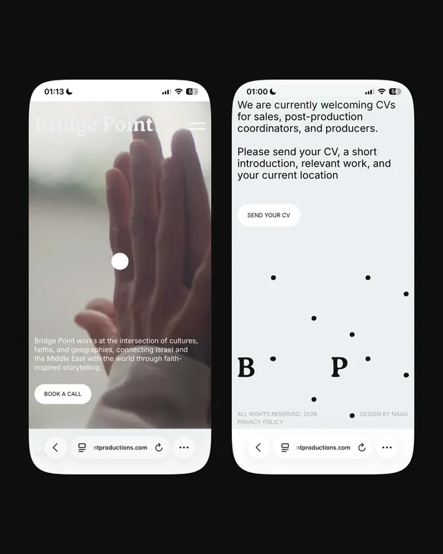
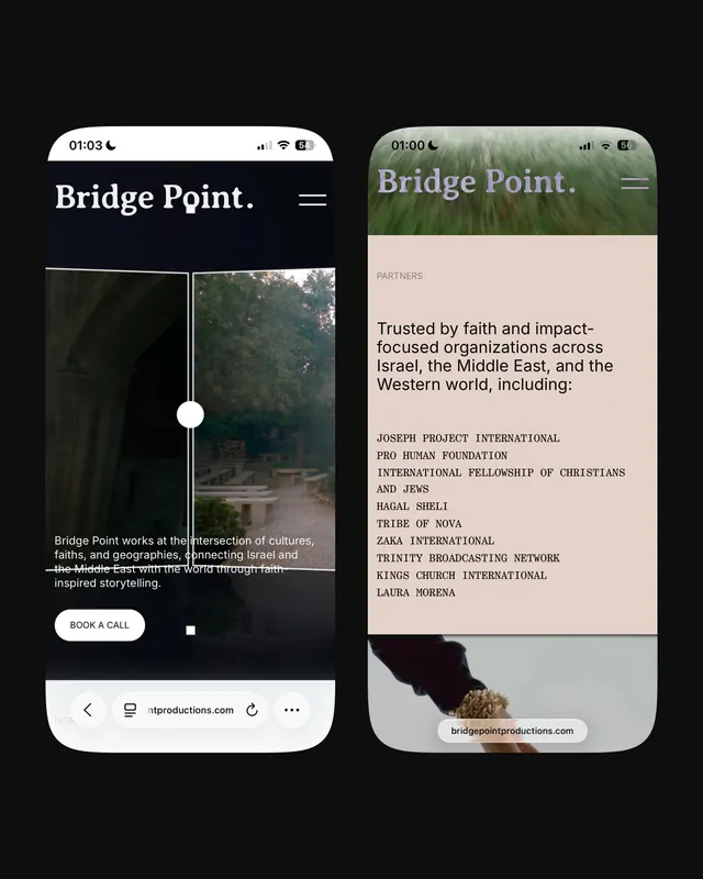
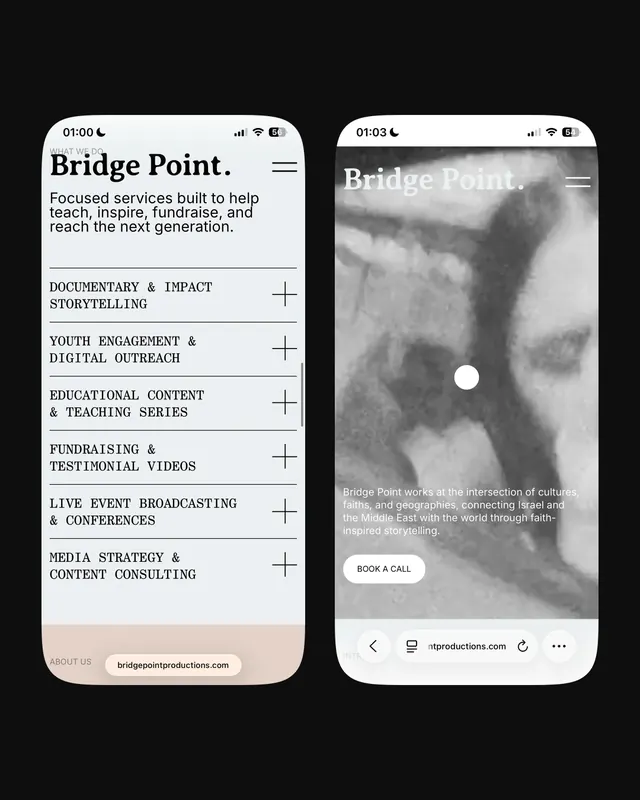
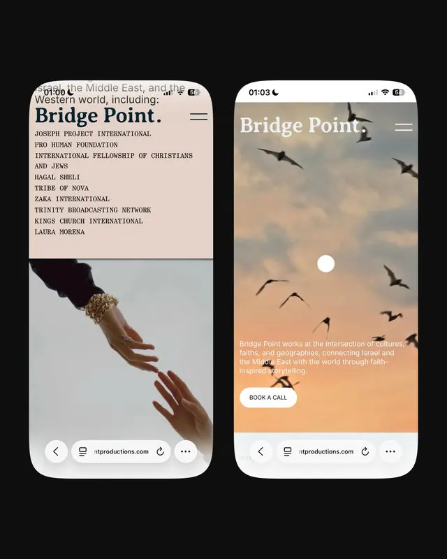
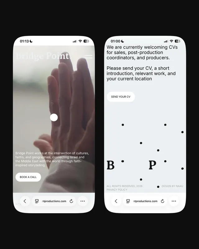
A five-slide mobile website design for Bridge Point, a faith-inspired storytelling organization, emphasizing nature imagery and minimalist typography.

Summary
A minimal, photo-led mobile website design for Bridge Point that balances striking landscape imagery with clean typography, structured information hierarchy, and subtle dot-based pattern accents.
Visual description
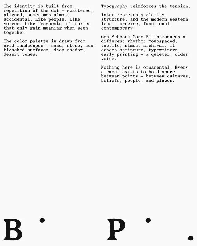
Slide 1 presents the hero screen with blurred green landscape photography as background, overlaid with the "Bridge Point." wordmark and navigation menu, a carousel indicator, and footer action. Slides 2-3 shift to light sand/cream backgrounds with black serif headlines, displaying partner logos and service offerings in a columnar layout with expandable sections (indicated by plus icons). Slide 4 returns to photography with a misty landscape and the mission statement in white sans-serif overlay. Slide 5 shows an identity detail slide with blue text, dots scattered across a light background, explaining the dot pattern as representative of connection and the identity system.
Key takeaway
The strategic use of full-bleed photography against minimal text creates emotional resonance while maintaining clarity. The dot pattern, explained in the final slide, acts as a unifying visual system connecting the disparate design elements. The monospace and sans-serif type pairing reads both modern and approachable.
Reuse notes
Excellent template for nonprofit or mission-driven organizations seeking a sophisticated web presence. The nature photography paired with restrained typography conveys trust and contemplation. The dot pattern is a clever, scalable branding element that could work across digital and print. Best suited to campaigns around faith, social impact, sustainability, or cross-cultural initiatives. The minimal color palette (blacks, creams, earth tones) works well in North American and Western markets; may need regional adaptation for other contexts.