Preview image. Unlock full-res
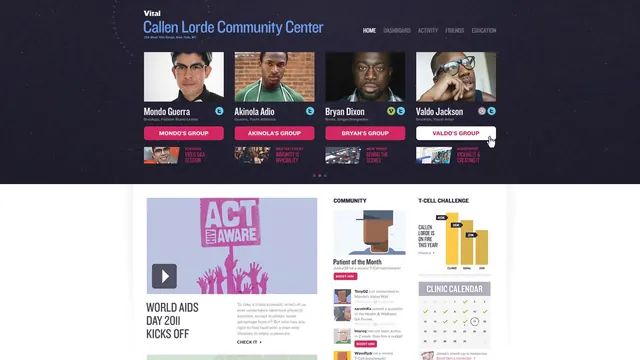
A dark-themed community center web interface with user profiles, group galleries, and activity feeds in a grid-based layout.
Summary
A community health center website dashboard showing user profile cards, activity feeds, and section navigation with strong use of magenta accent color against a dark background.
Visual description
Dark navy background hosts a prominent header with the "Callen Lorde Community Center" wordmark in light blue. Below: a horizontal carousel of four user profile cards, each with a portrait image, name, role, and a bright magenta group button. Lower section shows nested cards for campaign highlights ("Act & Aware", "World AIDS Day 2011"), stats, and community challenges. Navigation menu at top right (Home, Dashboard, Activity, Friends, Education). Bright magenta and golden yellow serve as primary action colors throughout.
Key takeaway
The card-based system that scales content density; magenta as an accessible pop of energy on dark; and the grouping pattern (profile + group label + sub-content) for community platforms.
Reuse notes
Effective for nonprofit or community health dashboards where equity and visibility are design goals. The dark theme reduces eye strain for extended use. Magenta reads boldly on dark and connotes LGBTQ+ inclusivity (context-appropriate for this institution). Beware of accessibility: test the magenta + dark contrast with WCAG validators.