Preview image. Unlock full-res
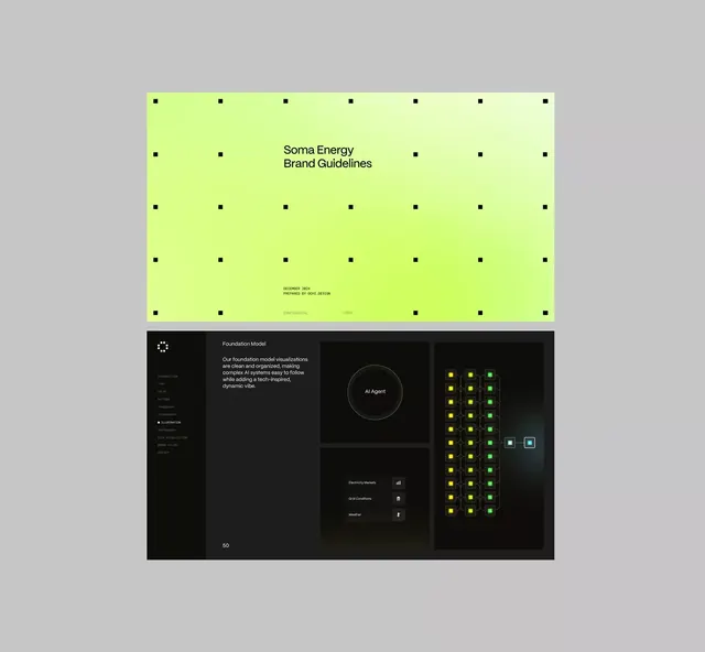
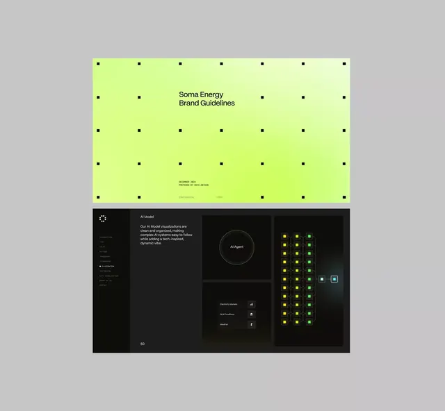
Brand guidelines presentation split between a neon lime-green cover page and a dark UI mockup showcasing brand application in a technical dashboard context.
Summary
Soma Energy brand guidelines presentation pairing a neon-lime cover design with a dark-UI mockup demonstrating the brand's color system applied to an AI model monitoring dashboard.
Visual description
The composition stacks two distinct sections. The upper half shows a bright neon-lime yellow background with centered black typography: "Soma Energy Brand Guidelines" as the primary headline, followed by a publication line "DECEMBER 2024 PREPARED BY DGM DESIGN" in smaller sans-serif, and footer credentials. A subtle dot-grid pattern in black (evenly spaced, full-width) provides structural rhythm. The lower half shifts to a dark charcoal interface mockup. A left sidebar lists text navigation ("AI Model" selected). The center column contains a heading "AI Model" with descriptive copy in light gray, a centered circle labeled "AI Agent" outlined in dotted lime-green, and callouts for "Electricity Markets" and "Grid Conditions" with icon indicators. The right side displays a dense grid of lime-green and cyan/turquoise squares (roughly 6 rows by 4 columns) representing data states or status indicators, with highlight squares in different hues. The sharp contrast between the screaming lime-green accents and the charcoal void demonstrates aggressive brand application in technical UI, positioning Soma as bold and data-forward.
Key takeaway
The two-tier presentation (brand brand-identity cover above, live UI application below) immediately demonstrates brand-to-product translation. The neon lime against dark charcoal creates unmistakable visual tension that signals innovation in energy/tech. The dot-grid on the cover ties to the square-grid in the UI mockup, creating subtle visual cohesion. Using the accent color sparingly in the UI (circles, squares, minor accents) keeps the dark interface readable while the color feels authoritative.
Reuse notes
Excellent template for tech-forward or energy-sector brand guidelines. The neon lime reads as sustainable energy or electrical energy without becoming a cliche. The dark UI context proves the brand works in real product. Be aware that pure, saturated lime-green fatigues the eye quickly on screens; consider adding brand guidance for toned versions or white space breathing room. Works best for B2B technical products, industrial software, or energy-sector corporate identity.