Preview image. Unlock full-res
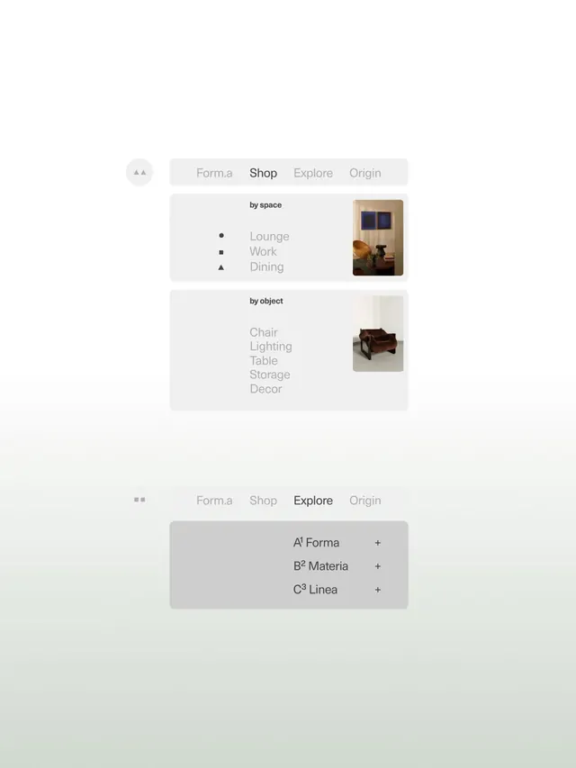
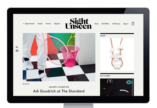
Minimalist website layout with a centered nav bar, large hero image, and asymmetric shop/content grid on the right.
Summary
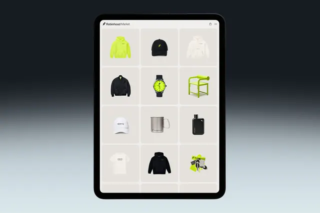
A clean desktop website mockup on a tablet frame with centered navigation, a large editorial image occupying the left, and a right sidebar containing product cards and section labels.
Visual description
A tablet-framed website with a white background. Top navigation reads "Departments Studio Homes Objects" centered with "Sight Unseen" as a bold logotype and right-aligned utility links (Shop, SU Offsite, SU Bureau, Sign In, cart). The main content splits left-right: a large image of colorful woven objects dominates the left; the right sidebar labels "SHOP" with a clean sans-serif header and displays product cards (a ceramic vessel, a dark interface element labeled "Eye Candy"). Footer text references an "Adi Goodrich at The Standard" excerpt.
Key takeaway
The asymmetric split layout (image vs. sidebar content) creates visual rhythm, and the restraint in color and typography keeps focus on the objects and navigation hierarchy.
Reuse notes
Effective for editorial e-commerce or design-focused brands. Works well when you have strong imagery for the main content area and need to present secondary product/collection navigation cleanly.