Preview image. Unlock full-res
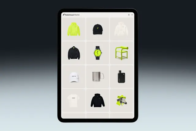
A tablet-scale product grid interface showing a 3x4 layout of product images (apparel, watches, home goods) with consistent thumbnail styling on a light beige background.
Summary
A clean e-commerce product grid interface on a tablet device showing twelve items arranged in a 3x4 layout with generous white space, consistent product photography, and a minimal header.
Visual description
A tablet screen displays a product grid with three columns and four rows of identical square tiles, each containing a product photo (hoodies, hats, watches, mugs, shoes). Each tile has a consistent light beige background and is separated by generous padding. The overall interface background is light gray-beige. Product images use consistent photography style and cropping. Navigation appears minimalist at the top of the screen.
Key takeaway
Generous padding and consistent grid spacing creates clarity and allows viewers to process multiple products without cognitive overload. Restraint in visual hierarchy makes the products the focus.
Reuse notes
Strong template reference for any e-commerce or marketplace design, especially apparel and home goods. The 3-column grid with square tiles works particularly well on tablets and desktop viewports.