Preview image. Unlock full-res
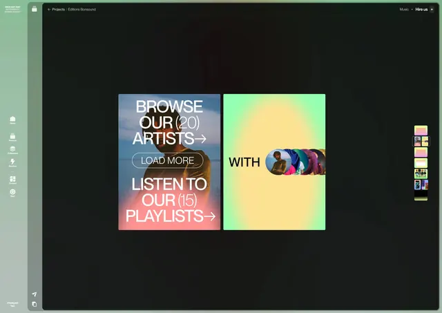
A dashboard interface showcasing stacked content cards with vibrant gradient backgrounds and clear navigation options for browsing artists and playlists.
Summary
A dark-themed music curation interface displays two prominent content cards with bold gradient backgrounds (blue-to-orange and yellow-to-green) and clear CTAs for browsing artists and playlists, flanked by a sidebar navigation and color swatches.
Visual description
Against a dark charcoal background, two large rectangular cards occupy the center. The left card has a gradient from cool blue to warm coral, displaying white sans-serif text ("BROWSE OUR (20) ARTISTS" and "LISTEN TO OUR (15) PLAYLISTS") with a "LOAD MORE" button. The right card uses a yellow-to-lime gradient with a small circular element containing colorful thumbnail images. Subtle sidebar navigation and a color palette strip appear on the right edge.
Key takeaway
Stacked gradient cards create visual hierarchy and depth on a dark background. The color field becomes part of the content itself, with each gradient conveying category or mood. Oversized, directional type paired with action buttons guides user flow.
Reuse notes
Strong pattern for music, creative, or media applications. The gradient cards work particularly well when categorizing diverse content. The dark background maximizes contrast and makes the colorful cards the focal point. Pair this with clear icon systems or image overlays for more complex data.