Preview image. Unlock full-res
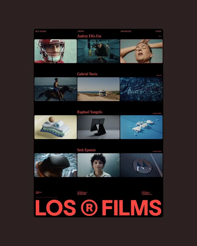
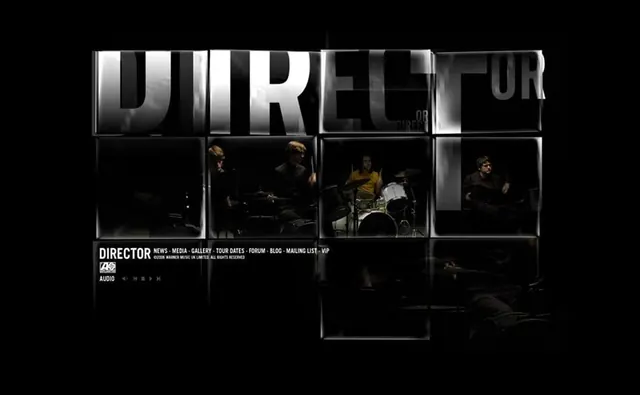
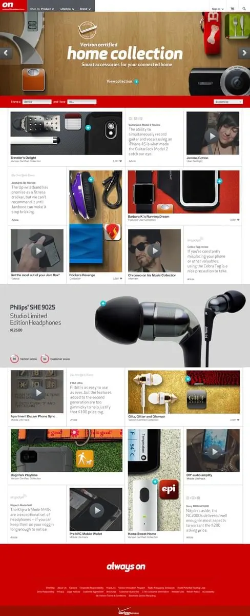
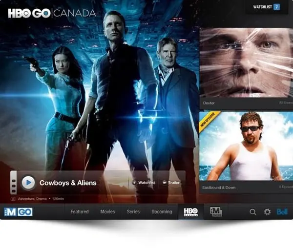
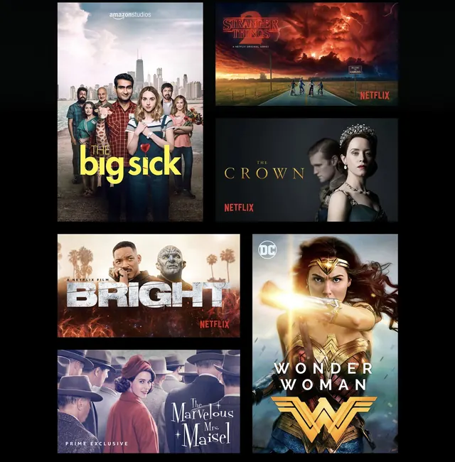
Grid-based layout of streaming content tiles showcasing multiple Netflix and streaming service titles with promotional imagery and branding overlays.
Summary
A dark-background streaming content grid interface displaying Netflix and other streaming titles arranged in a structured, boxed layout with promotional imagery and logo overlays.
Visual description
A dark background (nearly black) serves as the container for a 3x2 grid of content cards. Each card is a rectangular tile containing a promotional image from a streaming title (Amazon Studios' "The Big Sick," Netflix's "Stranger Things," Netflix's "The Crown," Netflix's "Bright," Prime's "The Marvelous Mrs. Maisel," and DC's "Wonder Woman"). Each card overlays its respective streaming service logo in the bottom-right or visible area (Netflix red logo appears on multiple cards). The cards are separated by subtle dark gutters, creating a clean, organized grid. Typography is minimal, limited to title branding visible in the imagery itself. The overall tone is professional and navigational, typical of a streaming service interface or showcasing interface.
Key takeaway
A dark background and consistent card sizing create a focused, organized grid that lets content imagery dominate. The strategic placement of branding (logos in corners) maintains platform presence without overwhelming content. Guttering and negative space between cards improve scannability and visual breathing room in a dense multi-item layout.
Reuse notes
Ideal for streaming, content-heavy platforms, or any service displaying a large catalog. Works well on large screens and is inherently responsive when card sizing is flexible. The dark background reduces eye strain during prolonged use, making it suitable for entertainment contexts. Grid layouts like this scale to various screen sizes when implemented with CSS Grid or Flexbox. Consider testing card ratios and spacing on mobile; this layout assumes wider viewports where horizontal scrolling or pagination is necessary.