Preview image. Unlock full-res
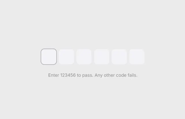
A polished six-digit OTP input UI component showcasing multiple states including typing, error with a red strikethrough digit, and a smooth animated green border on success.
Summary
A polished six-digit OTP input UI component showcasing multiple states including typing, error with a red strikethrough digit, and a smooth animated green border on success.
Visual description
Six rounded-square input fields are arranged horizontally on a soft gray background, with the leftmost field displaying an active focus state indicated by a subtle darker gray border. Unfilled input fields remain neutral white, creating clear visual hierarchy. Below the inputs sits centered instructional text in muted gray reading 'Enter 123456 to pass. Any other code fails.'
Key takeaway
Signal the active input field through a restrained border treatment rather than bright highlights, maintaining clean minimalism while directing attention through subtlety.
Reuse notes
Reach for this as a ui screen reference. Pairs with minimal, clean directions. Original by Swami.