Preview image. Unlock full-res
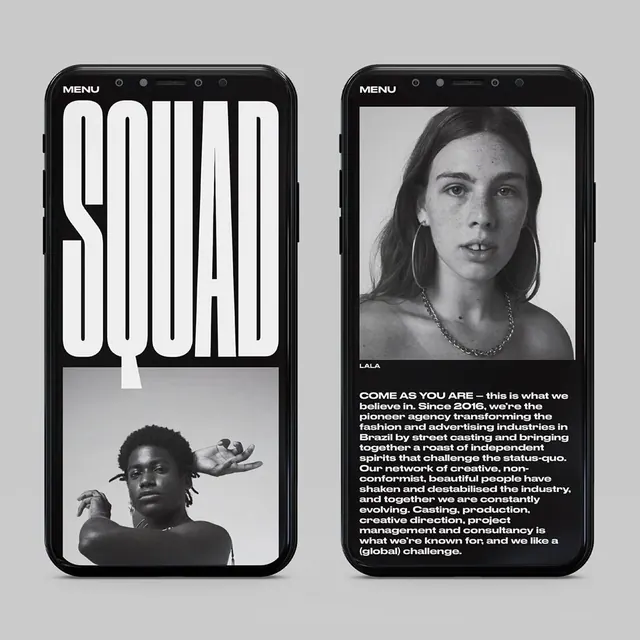
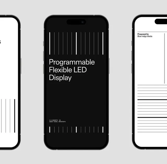
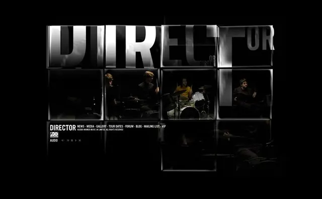
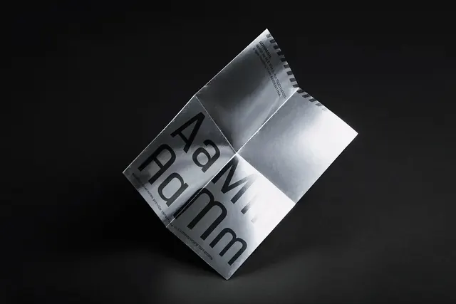
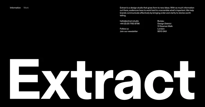
A bold, brutalist web design using heavy sans-serif type, high contrast, and asymmetric layout with minimal visual hierarchy.

Summary
A deliberately stark and assertive web design embracing brutalist principles: massive typography, high contrast, no decoration, and raw, intentional asymmetry.
Visual description
Pure black background (#000000) with large, heavy white sans-serif type (#FFFFFF) in all caps. Text size varies dramatically, creating visual dynamism through scale alone, not color. Layout is intentionally off-balance and irregular, with type blocks positioned at unexpected angles or locations. Secondary information appears in lighter gray (#666666). No images, icons, or decorative elements; the typography IS the design. The overall impression is powerful, confident, and unapologetic.
Key takeaway
Brutalism as a statement: stripping away all ornament and relying entirely on scale, contrast, and positioning to create visual impact. Bold typography and asymmetry communicate confidence and personality. This style works because it is so different from mainstream design.
Reuse notes
Ideal for design agencies, creative studios, cultural institutions, or brands that want to stand out through bold statements rather than beauty. Works exceptionally well in web and print contexts. Not suitable for products prioritizing approachability or friendliness. Use with confidence; this style requires conviction to execute well.