Preview image. Unlock full-res
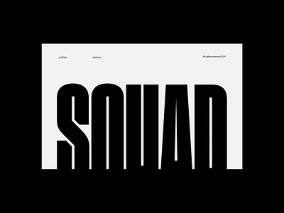
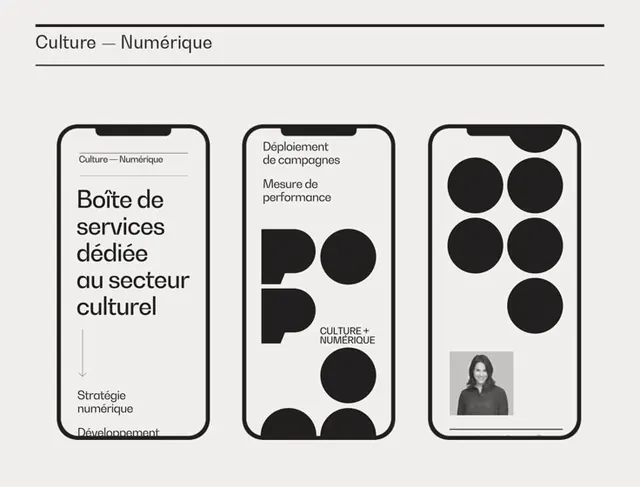
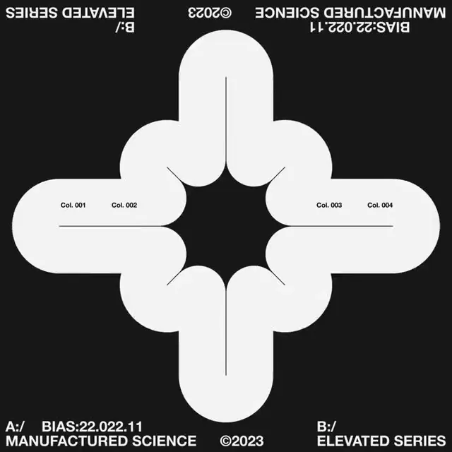
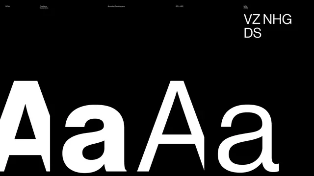
An extreme high-contrast two-tone composition in pure black and white, suggesting a corporate or tech brand's minimalist aesthetic.
Summary
A stark, ultra-minimalist composition split between near-pure black and near-pure white, evoking corporate austerity and technical precision.
Visual description
Exactly what it appears: roughly equal halves of #050505 (deep black) and #F7F7F7 (near-white), likely used as a divider, transition, or thematic element in a corporate interface. The extreme contrast is intentional and carries visual weight. No visible texture, gradient, or detail—just two solid tones meeting at an implied line.
Key takeaway
Sometimes the strongest design move is the simplest: two complementary extremes create immediate visual impact and clear hierarchy without decoration. This is the epitome of modern corporate minimalism.
Reuse notes
Use as a divider between content blocks, a hero background half, or to represent binary concepts (on/off, light/dark, forward/backward). Works especially well for tech and financial brands seeking a 'no-nonsense' aesthetic. May feel cold without accompanying rich imagery or color.