Preview image. Unlock full-res
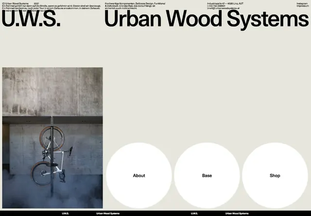
Minimalist brutalist website header pairing raw textured concrete imagery on the left with a clean navigation menu of white circles on the right.
Summary
A split-screen website header for an urban wood systems company pairing raw concrete textures and a bicycle product on the left with navigation buttons labeled About, Base, and Shop in white circles on the right.
Visual description
The layout divides vertically: the left half shows two stacked photographs of concrete texture above a street-level photograph of a fixed-gear bicycle on asphalt, both in muted grays and blacks. The right half is pale beige with three large white circles arranged horizontally in the middle, each containing a single navigation word in bold sans-serif (About, Base, Shop). A dark bar anchors the bottom, and the U.W.S. wordmark with the full company name appears in clean sans-serif at the top. The overall palette is monochromatic: off-white, cool gray, charcoal, and pale gold tones, reinforcing industrial minimalism.
Key takeaway
Juxtaposing textured photographic material on one side with pure geometric navigation shapes (circles) creates visual balance between narrative and function. Large white space around the navigation makes each button breathable and important. The concrete and bicycle imagery conveys material honesty and sustainability without explanation; the design lets the product speak.
Reuse notes
Strong for b2b industrial, sustainable, or architectural brands. The stark monochrome requires high-quality photography to avoid feeling dull; pair with equally refined typography. The circular navigation is effective for primary calls (three to five options); overload breaks the minimalist intent.