Preview image. Unlock full-res
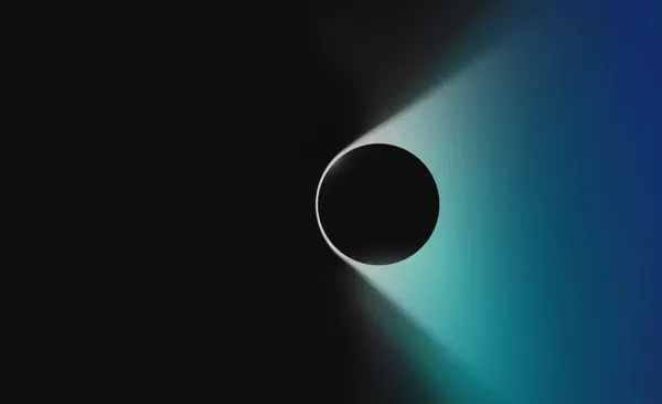
A horizontal interface or product visualization in dark charcoal with teal and blue-grey accents, suggesting immersive tech product UI.
Summary
A professional product visualization for Microsoft HoloLens using a dark teal color palette with subtle blue-grey accents, presenting an immersive tech interface.
Visual description
Landscape layout (600×366) with dark charcoal base (#101C26, ~71%) dominant, complemented by teal (#449496, ~18%) and light blue-grey (#92B0AD, ~7%) accents. The composition suggests a user interface or product visualization with distinct zones of color—likely showing an immersive technology context. The teal provides a cool, futuristic accent without overwhelming the composition. Typography is clean sans-serif. The overall feel is sophisticated, tech-forward, and professional.
Key takeaway
BUCK's use of teal within a dark palette for HoloLens demonstrates how muted cool tones signal premium, high-tech products. The restraint—no bright neons or harsh accents—conveys confidence and sophistication in the immersive/AR/VR space.
Reuse notes
Excellent reference for hardware product UI, immersive experiences, and enterprise tech branding. The teal-on-dark palette is becoming a subtle convention in AR/VR product design. Source is a professional studio (BUCK, working for Microsoft), so production quality and strategic thinking are evident. This is a high-confidence reference for modern tech product language.