Preview image. Unlock full-res
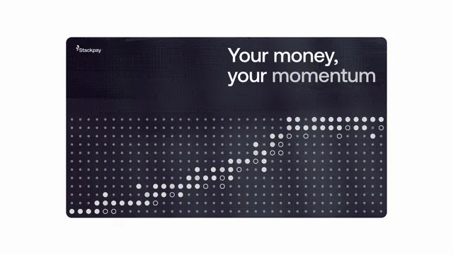
Dark mobile fintech dashboard displaying transaction momentum via a large dot-matrix data visualization below white serif headline on navy background.
Summary
Dark mobile fintech dashboard displaying transaction momentum via a large dot-matrix data visualization below white serif headline on navy background.
Visual description
Dark navy rectangular card occupies most of the frame. Top section holds left-aligned "Stackpay" logotype and right-aligned white serif headline "Your money, your momentum" in large type. Below, a dot-matrix visualization: rows of small dots forming a distribution curve, with density increasing toward the right side (suggesting growth or momentum). Dots are white and light gray on dark background, creating a technical, data-forward aesthetic. High contrast between text and background ensures legibility on mobile.
Key takeaway
The dot-matrix as an alternative to standard bar or line charts, particularly for suggesting distribution or momentum trends. Pairing a serif headline with sans-serif data visualization creates elegant hierarchy without clutter. Dark background with high-contrast white type works for mobile dashboards emphasizing data readability.
Reuse notes
Strong for fintech dashboards, payment apps, or product-momentum screens where you want to convey numeric trends without overwhelming charts. The dot-matrix works well for distribution curves, growth visualization, or transaction patterns. Requires careful sizing to remain readable at mobile scale. White and light gray dots should maintain sufficient contrast ratio; avoid adding color unless the color mapping is clear from context.
More like this


Keep what you find
A free account saves references to boards and can send you a weekly email of picks based on what you save.
To see every result, go Pro.