Preview image. Unlock full-res
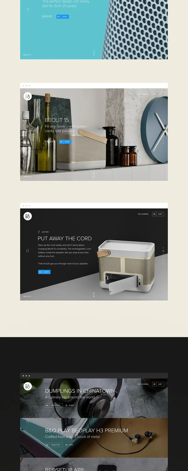
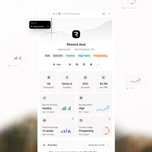
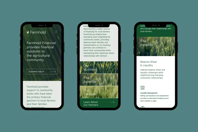
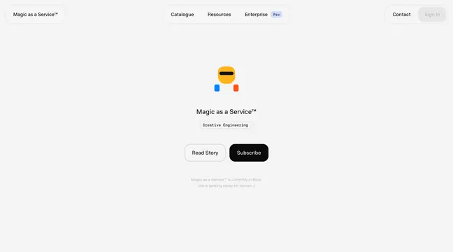
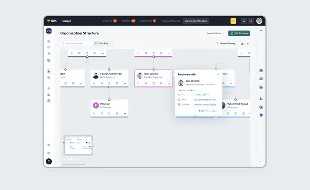
A horizontal interface composition with muted blue, beige, and dark tones in a clean, card-based layout.
Summary
A horizontal UI layout using a muted blue, cream, and dark palette with card-based organization and minimal visual noise.
Visual description
Landscape interface (1080×719) with soft, muted color palette: a warm-leaning blue-grey (#8AA5BD) as a dominant background or section, accented with cream (#EBE1DA) and dark charcoal (#273836). The composition suggests a dashboard or interface with distinct card or block elements, organized in a calm, uncluttered manner. Typography is clean and sans-serif. The overall feel is restful and professional.
Key takeaway
The restraint of the muted color palette creates a mature, approachable interface—the soft blues and creams are less common in tech UI, offering an alternative to bright accent colors or high contrast.
Reuse notes
Strong foundation for applications targeting wellness, professional services, or older demographics who prefer softer visual presentation. The palette is also useful for reducing visual fatigue in dashboard-heavy applications. Source is unknown, which limits context.