Preview image. Unlock full-res
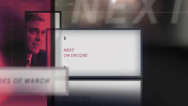
A broadcast or streaming interface screen displaying 'Next On Encore' copy with a portrait photograph and overlaid grid layout, rendered in warm muted tones and soft focus.
Summary
A broadcast UI screen mockup showing a "Next On Encore" navigation element with a portrait photograph and grid overlay, rendered in soft, warm muted tones.
Visual description
The composition shows an overlaid interface design with a portrait photograph on the left side tinted in warm pink and burgundy tones. A grid overlay with time-code numbers (visible values like "7.00", "8.00", "4.00") spans the top. On the right side, a clean white container displays "NEXT" in a forward arrow symbol and "ON ENCORE" in a light pink serif or display font. A white rectangular frame creates visual hierarchy. The overall aesthetic is soft and slightly out of focus, suggesting a broadcast preview or upcoming content screen.
Key takeaway
Using a soft-focus photographic background with clean UI elements (a white frame and serif type treatment) to create elegant depth and visual clarity in a broadcast interface without competing for attention.
Reuse notes
Works well for broadcast, streaming, or entertainment interfaces where upcoming content needs soft, inviting presentation. The warm color palette and muted tones suit premium or lifestyle brands. The grid overlay is particularly effective for time-based content systems.