Preview image. Unlock full-res
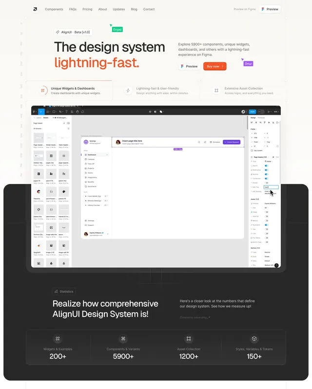
Light hero with orange accent headline, three feature cards, embedded Figma screenshot, and dark statistics band for a component library product.
Summary
A stacked landing hero for a Figma design system: bold headline with orange accent, three bordered feature cards, a full Figma UI screenshot, then a dark statistics grid proving scale.
Visual description
White page with top nav (logo, text links, Preview on Figma CTA). Beta pill badge above oversized headline "The design system lightning-fast" with orange emphasis. Sub-copy cites 5900+ components. Two CTAs: white outlined Preview and solid orange Buy now. Floating collaborator name tags simulate live Figma cursors. Three equal feature cards with icons describe widgets, speed, and assets. Large Figma interface screenshot shows dashboard mockup with sidebars and property toggles. Bottom transitions to charcoal band with Statistics badge, headline, and four-column stat grid (200+ widgets, 5900+ components, 1200+ assets, 150+ tokens).
Key takeaway
Collaboration cursor labels sell the Figma-native story without animation. Pairing hero claims with an in-app screenshot and a dark stats band closes the proof loop in one scroll.
Reuse notes
Strong template for design tools and component libraries. Needs a compelling product screenshot; stats must be defensible. Orange accent works on light only.