Preview image. Unlock full-res
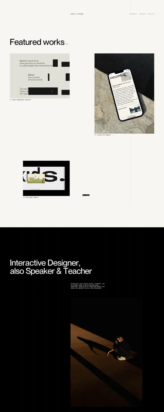
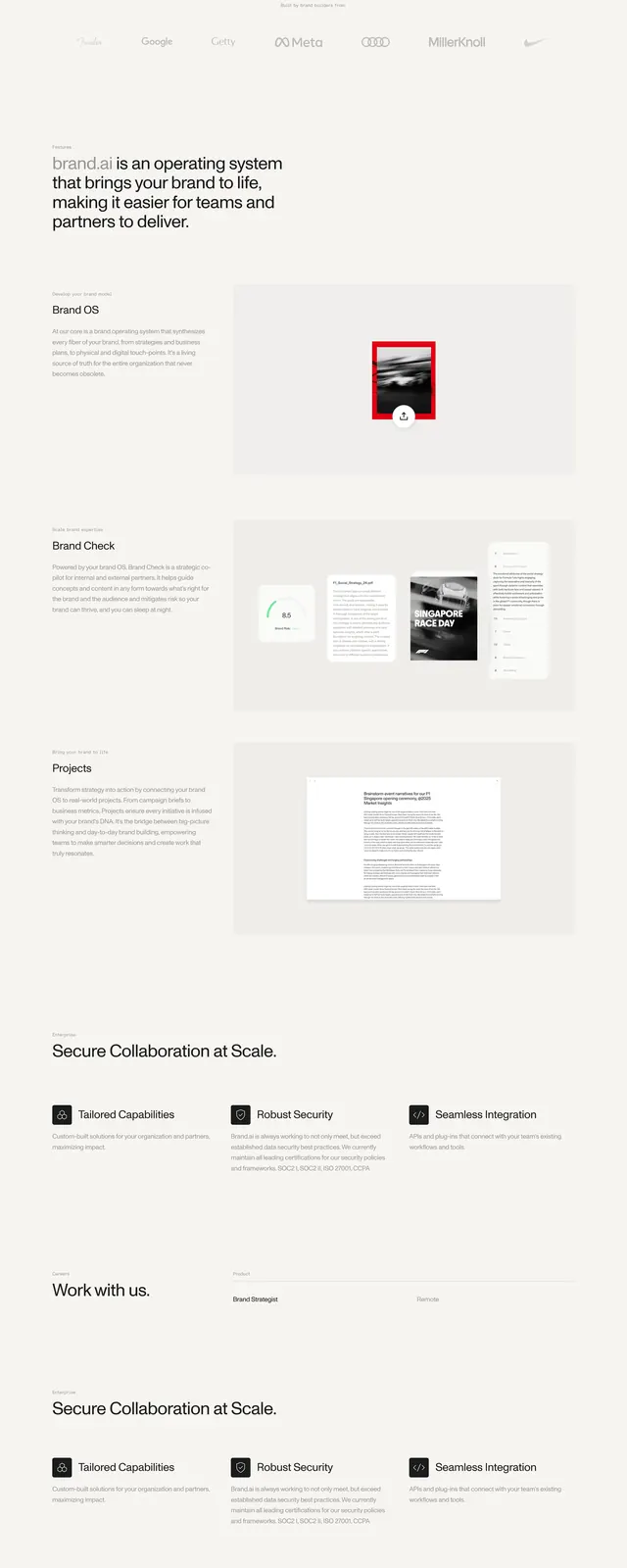
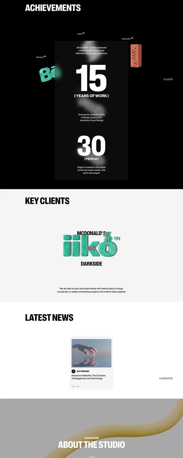
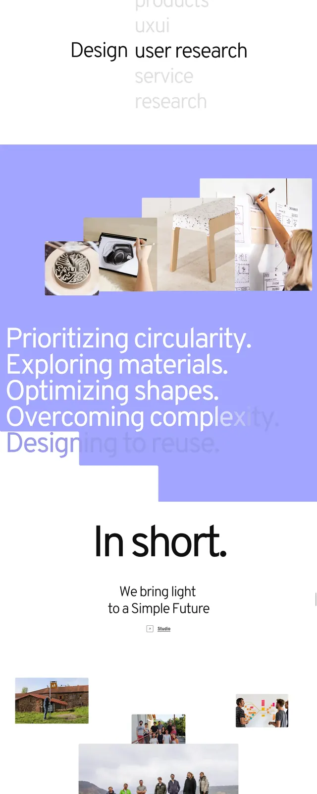
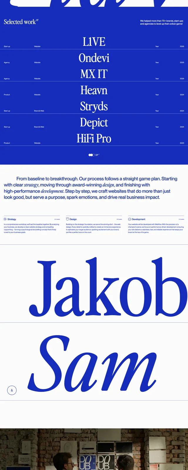
An editorial, high-contrast landing page for a branding agency with oversized serif typography, sparse navigation, and stark section breaks.
Summary
An editorial, high-contrast landing page for a branding agency with oversized serif typography, sparse navigation, and stark section breaks.
Visual description
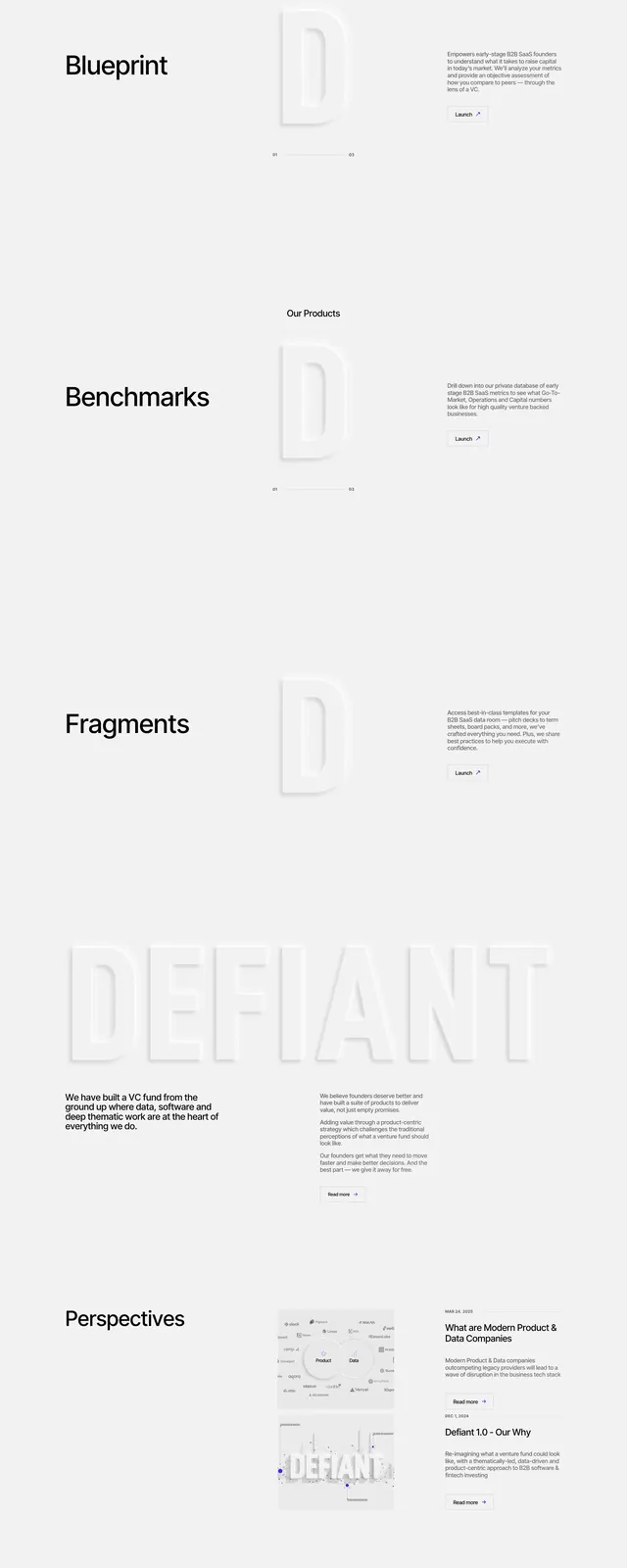
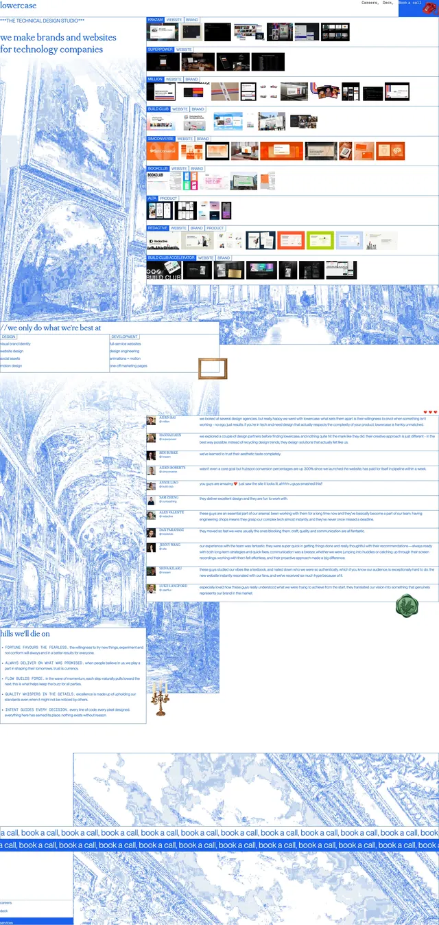
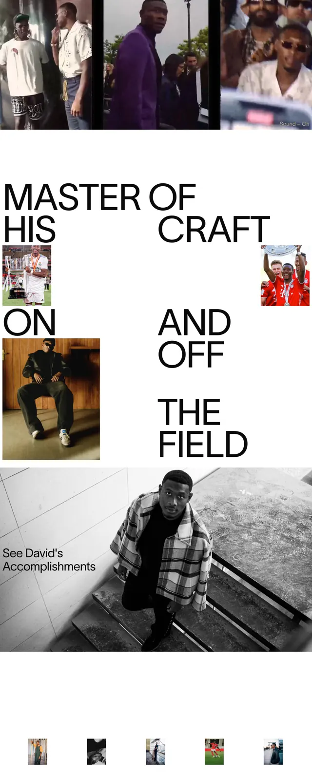
The page opens with a centered hero on an off-white background, using large serif typography and a single italic emphasis word. A minimal top navigation sits across the header, while the lower sections alternate between full-width brand blocks, sparse content areas, and a bold black industry list panel. The layout relies on generous whitespace, strong typographic hierarchy, and simple image inserts rather than dense UI components.
Key takeaway
The design feels like a luxury editorial brand site adapted for an agency pitch. Its strength is the contrast between restrained spacing and oversized type, which makes the message feel sharp and confident.
Reuse notes
Reuse the centered hero structure and the serif-heavy type hierarchy for premium agency or consulting sites. The alternating light/dark section treatment is useful for breaking a long page into memorable visual beats without adding complexity.