Preview image. Unlock full-res
Event catering feature with oversized serif intro, vertical restaurant photo left, and celebration copy with Explore Services CTA right.
Summary
An event dining feature led by a large serif value statement, then an asymmetric split with warm restaurant interior photography and a secondary headline plus Explore Services CTA.
Visual description
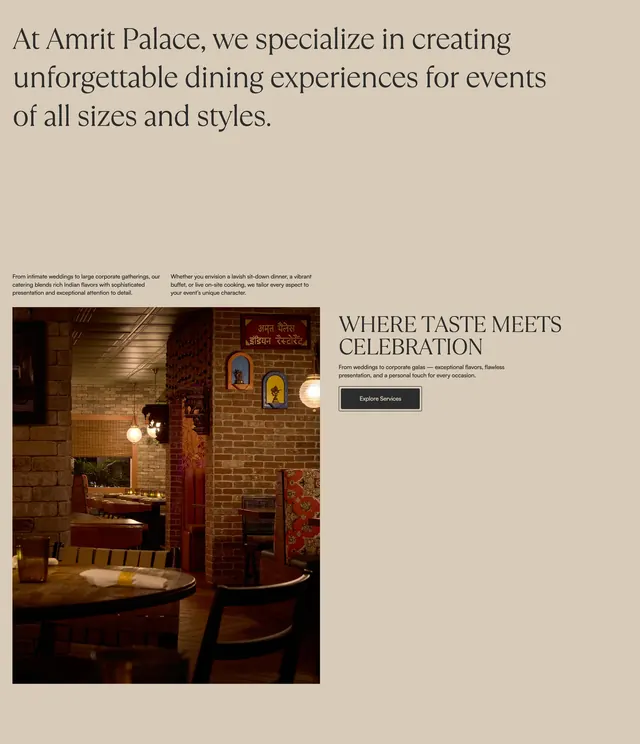
The section sits on a uniform warm beige background. The top third is a large left-aligned serif paragraph stating that Amrit Palace creates unforgettable dining experiences for events of all sizes, with two smaller sans-serif supporting lines beneath. The lower area splits asymmetrically: a tall vertical photo on the left shows an intimate restaurant interior with exposed brick, arched wall niches, Hindi signage, globe pendant lights, and a wooden table edge in the foreground. The right column carries the all-caps serif subhead WHERE TASTE MEETS CELEBRATION, a short sans-serif line about weddings and corporate galas, and a dark rectangular Explore Services button with thin white border and white label. Generous whitespace pads the right text block.
Key takeaway
Lead with one long serif statement instead of a short punchy headline, then let a single atmospheric interior photo and a quieter secondary message close the section. The hierarchy feels consultative rather than promotional.
Reuse notes
Good for catering, venues, or hospitality brands selling events and private dining. Needs a strong interior or venue photo and enough copy to justify the oversized intro line. Pairs with the beige-and-charcoal Amrit Palace system used across sibling sections.