Preview image. Unlock full-res
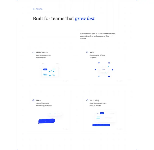
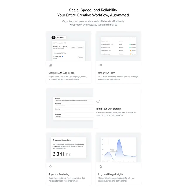
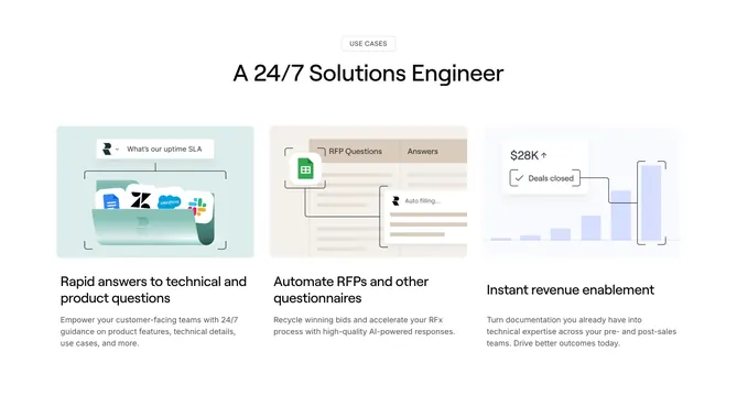
Light bento-style features grid where eight cards pair a heading and copy with a small product UI mockup of each capability.
Summary
A light bento-grid features section where a centered badge and heading sit above eight cards, each combining a short benefit heading, a line of copy, and a small mock UI illustrating that specific feature. Each card carrying its own miniature product UI is the defining device.
Visual description
Light grey background. Centered top: a small "One Stop Solution" pill badge, a dark heading "Why Cowlendar?", and a three-line grey supporting paragraph. Below, a bento grid of light rounded cards in uneven sizes. The top row of three cards shows: an integrations diagram with floating app logos and connector lines; an "August 2024" calendar widget with selected dates and emoji markers; and a world map with three timezone clocks (EST, IST, PST). A middle row of two wider cards shows an email-reminders UI with blue toggle rows and dropdowns, and an "Add Team Members" panel with an email input, send button, and member avatars. A bottom row of three cards shows a group-booking card with a forest photo, a custom meeting-duration selector with time pills, and a "Block Dates" panel with day toggles and holiday tags. Each card has its mockup on top and a bold heading plus grey description below.
Key takeaway
Giving every feature card its own purpose-built mini UI rather than generic icons, so the grid demonstrates the product capability by capability. The varied bento sizing keeps eight cards from feeling like a monotonous matrix.
Reuse notes
Strong for feature-rich consumer SaaS and app-store products that need to show many capabilities at once. Each mockup must be custom and legible, which is production-heavy. Light, friendly palette with a blue accent. The bento sizing requires planning which features deserve the larger cells.