Preview image. Unlock full-res
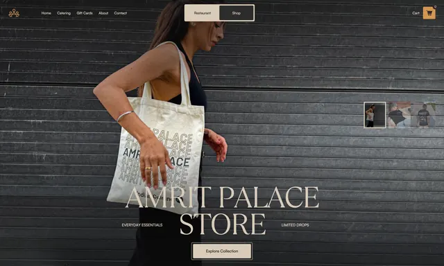
Dark full-bleed merchandise hero with lifestyle tote photography, Restaurant/Shop toggle, vertical product thumbnails, and a centered store headline.
Summary
A moody shop hero on corrugated metal featuring a model with a branded tote, a Restaurant/Shop segmented toggle, vertical product thumbnails, and a centered "Amrit Palace Store" headline with collection CTA.
Visual description
Dark horizontally ribbed metal shutter fills the background. Top bar shows a small gold ornate logo left, sans-serif nav links (Home, Catering, Gift Cards, About, Contact), a centered pill toggle with "Restaurant" on cream and active "Shop" on dark, and a tan square cart button with icon right. Center frame shows a woman in profile walking left to right in a black tank top, carrying a cream canvas tote printed with a repeating "AMRIT PALACE" grid (one bold black instance, others outlined) and "Indian Cuisine" below. Bottom center carries oversized cream serif "AMRIT PALACE STORE" flanked by thin rules and small caps labels "EVERYDAY ESSENTIALS" and "LIMITED DROPS." A tan bordered "Explore Collection" button sits below. Right edge stacks three small vertical thumbnails: the hero scene highlighted with a cream border on top, two lower shots of a person in a black "AMRIT" tee from behind.
Key takeaway
The Restaurant/Shop toggle makes dual-brand navigation explicit without leaving the page metaphor. Lifestyle product photography on an industrial backdrop elevates restaurant merch from novelty swag to a fashion-forward collection, with thumbnail previews suggesting more SKUs without a grid takeover.
Reuse notes
Works for hospitality brands selling limited apparel or goods alongside dining. Needs strong product photography and a clear shop subdomain or route behind the toggle. Thumbnail strip implies image swapping; wire up hover or click states so the hero updates. Dark photography demands high-contrast type and accessible button sizing.