Preview image. Unlock full-res
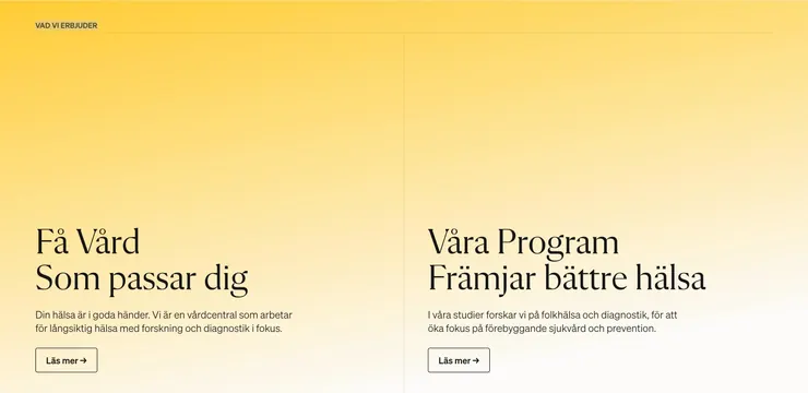
Two-column value section on a yellow-to-cream gradient with serif headlines and outlined read-more buttons.
Summary
VAD VI ERBJUDER band split by a hairline vertical rule into two equal care and research program columns on warm yellow gradient.
Visual description
Background gradients from medium yellow at top to pale cream at bottom. Small uppercase VAD VI ERBJUDER label sits top-left. Two columns separated by a thin vertical line. Left column: large black serif headline F� V�rd Som passar dig, gray sans body about long-term health with research focus, and rectangular L�s mer button with thin black border and arrow. Right column mirrors structure with headline V�ra Program Fr�mjar b�ttre h�lsa, body about public health studies and prevention, and matching outlined button.
Key takeaway
Serif headlines on a soft yellow gradient give healthcare copy warmth without stock photography. Symmetric two-offer columns with identical button treatment make dual service lines feel balanced.
Reuse notes
Useful for clinics, wellness brands, or any business presenting two parallel offerings. Gradient needs sufficient contrast for black text; outlined buttons stay legible on pale bottoms.
More value proposition sections
See all




More like this




Keep what you find
A free account saves references to boards and can send you a weekly email of picks based on what you save.
To see every result, go Pro.