Preview image. Unlock full-res
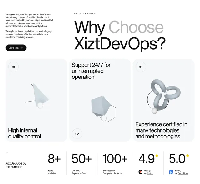
Value proposition section with three 3D-illustrated feature cards and a bottom stats bar with review ratings.
Summary
A why-us block pairing intro copy and headline with three numbered 3D feature cards and a five-stat metrics footer.
Visual description
White background. Top split: left column has small intro paragraph and black Let's Talk pill; right has YOUR PARTNER label above large "Why Choose XiztDevOps?" with Choose in gray. Middle row shows three tall light-gray rounded cards with abstract 3D shapes (prism, polyhedron, interlocking rings) and numbered circles; benefit copy at top or bottom of each card. Bottom stats bar divided by vertical rules: arrow intro text left, then 8+ Years, 50+ Experts, 100+ Projects, 4.9 Clutch star rating with logo, 5.0 GoodFirms rating with logo.
Key takeaway
Numbered cards with unique 3D motifs differentiate three value props without icon repetition. Stats bar with third-party review logos adds credibility below emotional cards.
Reuse notes
Strong for DevOps or IT consultancies with measurable track records. 3D art needs a consistent material language; stat numbers require periodic updates.
More value proposition sections
See all
More like this

Keep what you find
A free account saves references to boards and can send you a weekly email of picks based on what you save.
To see every result, go Pro.