Preview image. Unlock full-res
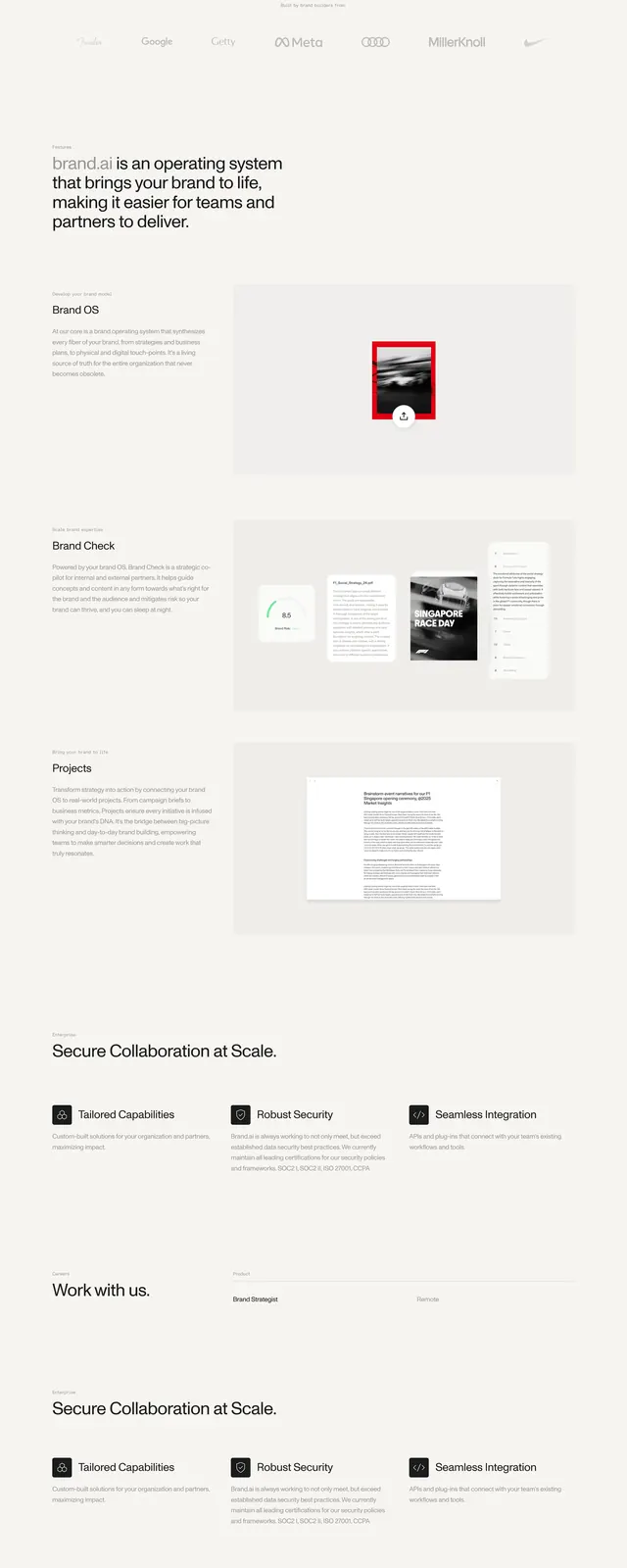
A light, minimalist brand-AI landing page with a centered hero, oversized headline, floating product imagery, and a sparse editorial layout.
Summary
A light, minimalist brand-AI landing page with a centered hero, oversized headline, floating product imagery, and a sparse editorial layout.
Visual description
The page uses a pale off-white background with a small top navigation bar, a centered logo mark, and a large bold headline reading "Your brand OS." A short supporting sentence sits beneath it, followed by a loose collage of overlapping brand and product images arranged left and right around a small call-to-action button. Lower on the page, the layout shifts into spacious split sections for "Brand Check" and "Projects," then a simple FAQ accordion and a dark newsletter-style footer with a large white brand mark.
Key takeaway
The strongest move is the restrained editorial hero: big centered type, minimal copy, and floating imagery that creates depth without clutter. The layout feels premium because it leaves a lot of negative space and uses only a few high-contrast elements.
Reuse notes
Use this pattern for AI, branding, or B2B SaaS landing pages that need to feel refined and credible rather than product-heavy. It works best when the hero can rely on a strong wordmark, a concise promise, and a few curated visuals instead of a dense feature grid.