Preview image. Unlock full-res
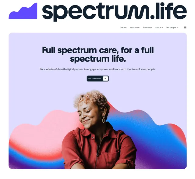
Centered lavender hero with an oversized two-line headline, a single dark CTA, and a cut-out portrait over pink, red, and blue grainy waves.
More like this
See all


Summary
A centered hero on a soft lavender panel that leads with a bold two-line headline, one dark call to action, and a portrait set in front of grainy gradient waves.
Visual description
A large dark-navy wordmark with a purple wave glyph sits top-left above a small nav row (Insurer, Workplace, Education, About, Our people) and a menu icon. The hero is a rounded lavender panel. Centered beneath the nav, a heavy sans headline reads "Full spectrum care, for a full spectrum life." over two lines, followed by one line of regular-weight sub-copy and a dark pill button with a white arrow chip ("Get to know us"). The lower half holds a cut-out photo of a smiling woman with short curly blonde hair, eyes closed, in a rust-red zip jacket. Behind her, pink, red, blue, and violet wave shapes with a visible grain bleed off the panel edges. The gradient is confined to the image area, so the type stays on a clean field.
Key takeaway
- The cut-out portrait over a gradient wave gives depth and a brand color story without a busy background.
- One dark button with an arrow chip is the only action, so it reads clearly against the soft field.
- A heavy headline with generous space above it gives the hero authority without extra decoration.
Reuse notes
Good fit for healthcare, wellbeing, or people-focused B2B pages that need warmth without losing clarity. It depends on a strong cut-out portrait and a brand gradient; plain stock photos will not carry the same wave treatment. The dark text sits on a light panel, so the layout does not translate directly to a dark-mode site.