Preview image. Unlock full-res
Dark three-column feature row for Canopy Core with glowing UI cards flanking a centered value proposition.
Summary
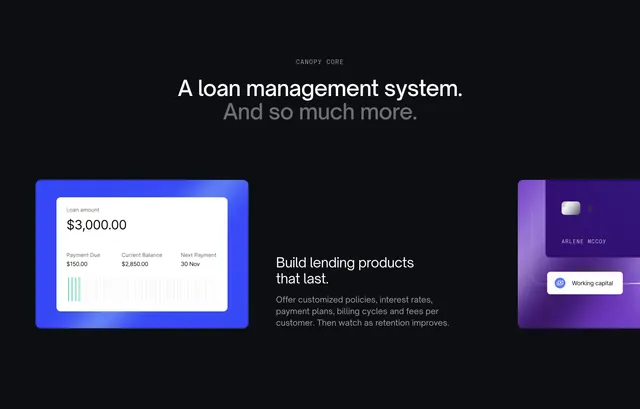
A dark-mode product spotlight for Canopy Core that centers copy between two glowing UI cards showing loan balances and a credit card preview.
Visual description
Near-black background. Centered gray all-caps "Canopy Core" label above a large white headline ("A loan management system.") with a lighter gray second line ("And so much more."). Three columns below: left card has a blue outer glow around a white loan summary UI with amount, due date, balance, next payment, and green progress bars; center holds white headline and gray paragraph on building lasting lending products; right card has a purple glow around a dark credit card with chip, embossed name, and a "Working capital" pill tag.
Key takeaway
Colored glow halos on UI cards to create depth on a flat dark section without background imagery. Sandwiching copy between two product proofs keeps the message and the interface equally visible.
Reuse notes
Strong for a flagship product module on a dark homepage band. Glow colors should map to product sub-brands. Needs polished UI screenshots on both sides to balance the text column.