Preview image. Unlock full-res
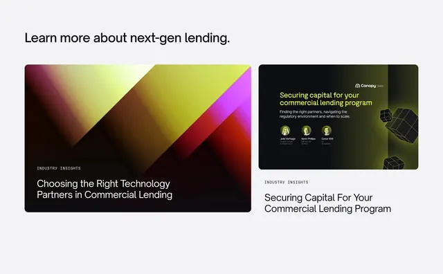
Two-column insights row with a wide abstract gradient card and a narrower webinar-style card with speaker headshots.
Summary
A content promo section with left-aligned headline and two unequal insight cards, one abstract editorial and one webinar panel with speakers.
Visual description
Light gray page background. Large black left-aligned headline about next-gen lending. Two rounded cards below: left is roughly two-thirds width with dark abstract diagonal planes in yellow, magenta, and brown, white "Industry Insights" tag, and white title on the image; right is narrower with a dark card showing lime-green headline, white subcopy, three circular speaker avatars with names and titles, floating green wireframe cubes, and Canopy logo, plus duplicate gray tag and title below the card.
Key takeaway
Asymmetric 2:1 card widths so one editorial piece dominates and a second format (webinar) reads as secondary without a separate layout. Repeating the category tag below the right card ties it to the left card's labeling system.
Reuse notes
Good for homepage content teases mixing articles and events. Abstract art card needs strong color blocking; webinar card needs real speaker photos. Works on light gray, not pure white, to soften the contrast.