
Preview image. Unlock full-res
Resources teaser with headline, explore link, and three comparison-style article cards using teal corner glows and vs-partner lockups.
Summary
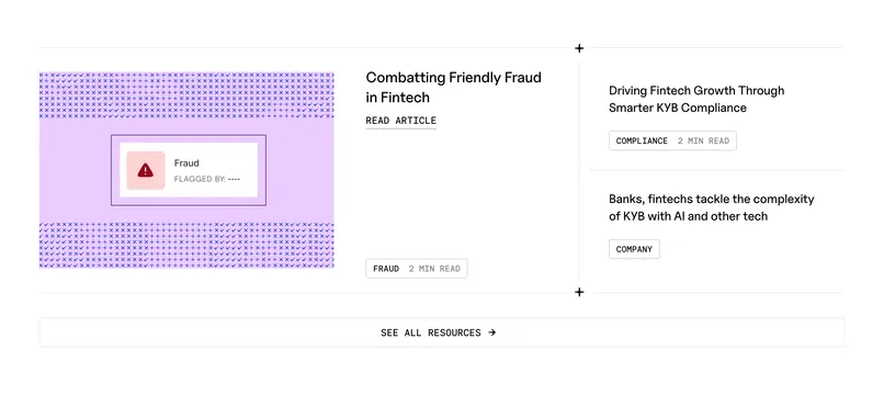
"Insights for builders" row promoting three competitive and partnership articles via glowing card art and captions beneath each tile.
Visual description
Cream background. Left header block uses large black "Insights for builders," gray explanatory subcopy, and right-aligned "Explore Resources" arrow link. Three rounded cards sit in a row: first two show cyan/teal radial corner glows with centered "Capability Comparison" or article titles and Highnote vs TabaPay/Astra or WEX logo pairs separated by gray "vs." Third card is plain white with Highnote x Fillip lockup. Captions below repeat full article titles about platform comparisons and Fillip fleet expansion.
Key takeaway
Turning blog thumbnails into mini competitive lockups makes thought leadership feel product-relevant. Soft corner glows add color without full-card gradients.
Reuse notes
Strong for fintech content marketing heavy on comparisons. Plain third card provides visual rest; alternate which tile stays minimal.
More blog list sections
See all










More like this

Keep what you find
A free account saves references to boards and can send you a weekly email of picks based on what you save.
To see every result, go Pro.