Preview image. Unlock full-res
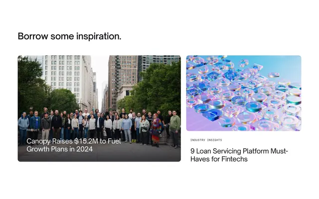
Blog preview section with asymmetric two-card layout, a large featured post with image overlay and a smaller secondary article card.
Summary
"Asymmetric blog teaser with a wide featured card using bottom gradient overlay and a narrower standard card beside it.
Visual description
White background with left-aligned bold black headline "Borrow some inspiration." Two cards below in roughly 60/40 split. Left: large rounded photo of a team on a city sidewalk with trees and buildings; dark bottom gradient carries white all-caps PRODUCT label and white headline about a funding announcement. Right: smaller rounded image of iridescent glass 3D shapes on purple-blue; below, gray INDUSTRY INSIGHTS label and black article title about loan servicing platform must-haves.
Key takeaway
Unequal card widths signal hierarchy without a "Featured" badge. Text-on-image gradient keeps photography full-bleed while preserving readability. Pairing a human team photo with abstract 3D art balances company news and thought leadership.
Reuse notes
Use on resource or use-case pages needing one hero story plus a secondary pick. Featured image must have clear lower-third space for overlay type. Secondary card relies on strong thumbnail art at smaller size.
More blog list sections
See all











More like this
Keep what you find
A free account saves references to boards and can send you a weekly email of picks based on what you save.
To see every result, go Pro.