Preview image. Unlock full-res
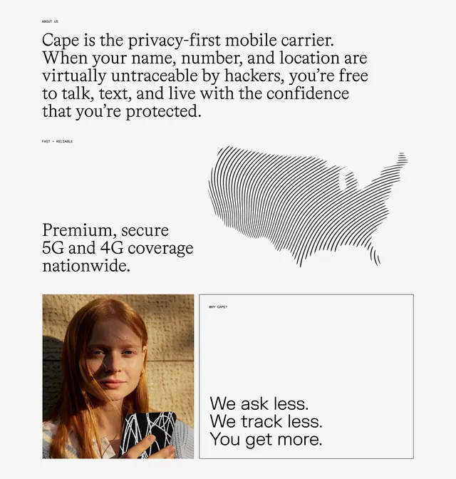
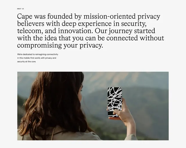
Multi-row about section mixing large serif copy, a line-art US map, a warm portrait, and a bordered value-proposition cell.
Summary
Editorial about grid stacking a privacy headline, coverage row with line-art map, and a photo paired with a bordered manifesto cell.
Visual description
White page in three tiers. Top: ABOUT US label and large serif paragraph defining Cape as a privacy-first mobile carrier. Middle row splits: left FAST + RELIABLE label and serif headline on 5G coverage; right shows a US map built from vertical wavy black lines. Bottom row: left square portrait of a red-haired woman in golden-hour light holding a phone with scribble-pattern case; right white box with thin black border, WHY CAPE? label, and serif line "We ask less. We track less. You get more."
Key takeaway
Mixing line-art data visualization with human photography covers rational and emotional proof in one section. Single bordered cell creates a pull-quote moment without a colored background. Consistent small all-caps labels unify disparate grid blocks.
Reuse notes
Ideal for consumer brands with a premium editorial site. Map graphic requires custom illustration; generic icons weaken the effect. Grid complexity needs careful mobile reflow to preserve reading order.
More about sections
See all


More like this

Keep what you find
A free account saves references to boards and can send you a weekly email of picks based on what you save.
To see every result, go Pro.