Preview image. Unlock full-res
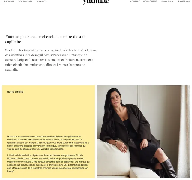
Editorial about section with centered scalp-care thesis, then a split origin story pairing pale yellow copy with a founder portrait.
Summary
A white editorial intro states the scalp-first philosophy, then a 50/50 origin block pairs warm yellow storytelling copy with a natural-light founder portrait.
Visual description
Standard white header with centered yuuamae logo and French nav links. A centered serif headline and left-weighted paragraph explain scalp-centered hair care on generous white space. Below, a full-width split section: left column on solid pale yellow with a small caps NOTRE ORIGINE label and two sans-serif paragraphs ending in an italic karma quote; right column is a vertical lifestyle photo of the founder seated on a white sofa in neutral tones with soft window light.
Key takeaway
The two-beat structure: one concise brand thesis up top, then human proof in a color-blocked split. Yellow is used only on the story panel, which separates philosophy from biography without adding clutter.
Reuse notes
Ideal for DTC beauty or wellness brands introducing founder narrative after a product-led homepage. Pairs well with serif headlines and restrained nav; needs a strong portrait and real copy to avoid feeling template-driven.