Preview image. Unlock full-res
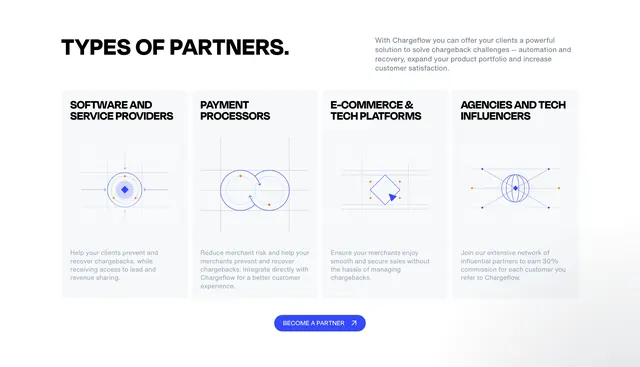
Light four-column partner categories section with blueprint-style vector illustrations and a centered CTA.
Summary
A white partner-program section titled "Types of Partners" with four equal cards for software providers, payment processors, e-commerce platforms, and agencies, each with a geometric line illustration and short copy, ending in a blue "Become a Partner" pill button.
Visual description
Large black all-caps headline sits top-left with a gray value-prop paragraph top-right. Four light-gray rounded cards span the width in a row. Each card stacks a bold category title, a blue wireframe-style diagram on a dotted grid with small orange accent dots, and muted body copy. Illustrations include a diamond hub, overlapping circles, a diamond with cursor arrow, and a wireframe globe. A bright blue centered pill CTA with white text and a diagonal arrow icon closes the section.
Key takeaway
The blueprint illustration system: one geometric motif per partner type on a shared dotted grid keeps four distinct categories visually unified. Pairing a left-aligned headline with a right-aligned intro paragraph balances the hero row before the card grid.
Reuse notes
Strong for B2B partner or ecosystem pages where each segment needs equal weight. Works on light backgrounds only; the thin line art needs enough card padding to breathe. Swap illustrations per vertical while keeping the grid-and-accent-dot language.