Preview image. Unlock full-res
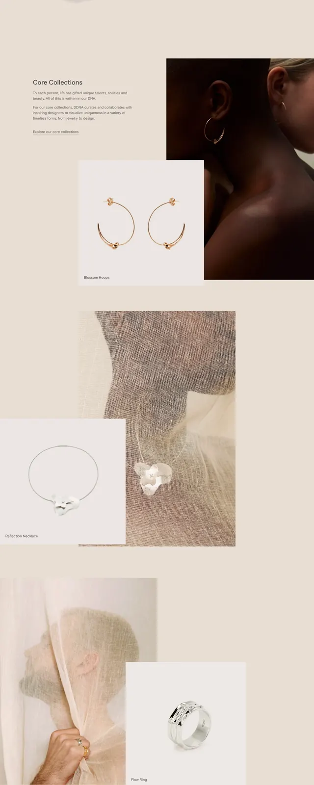
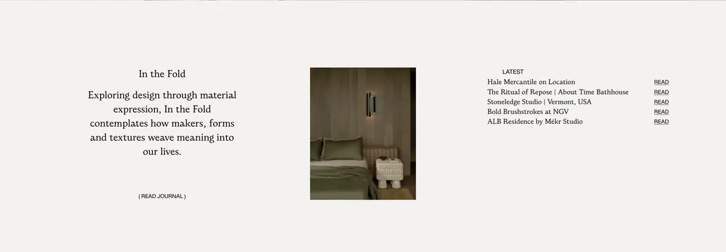
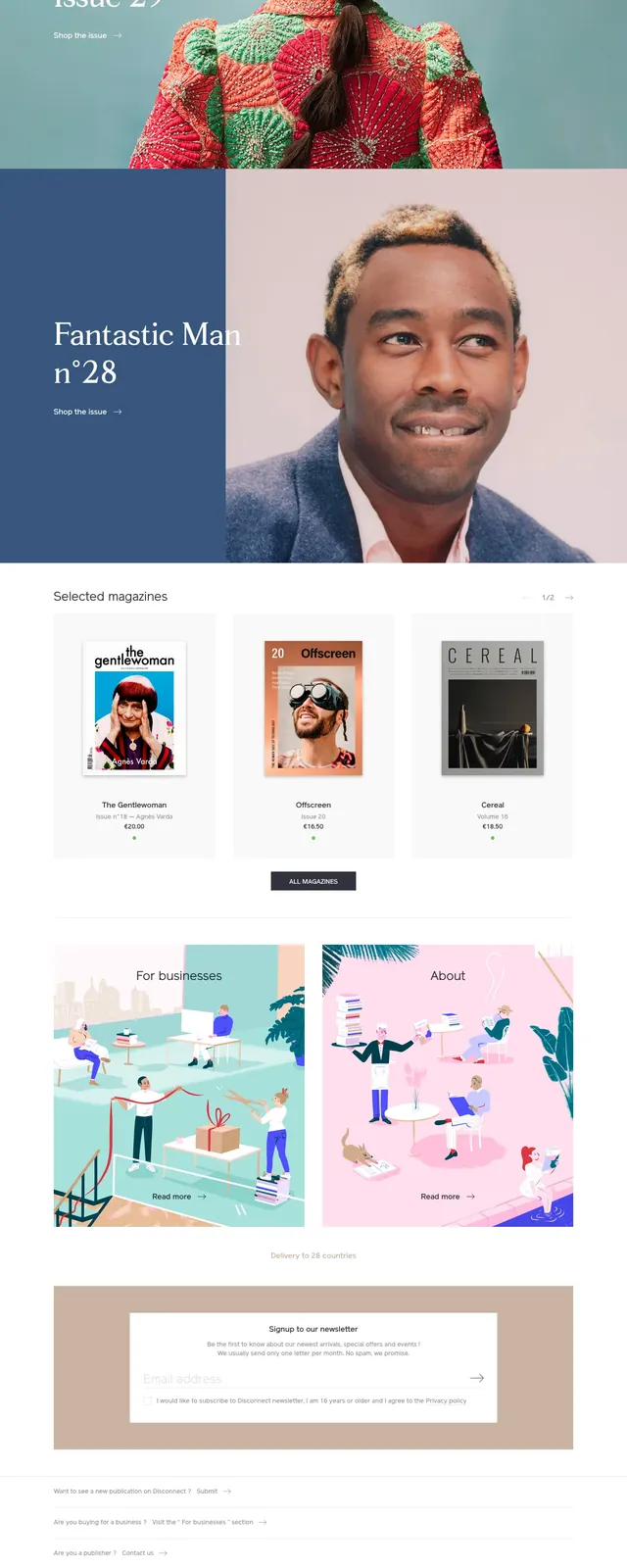
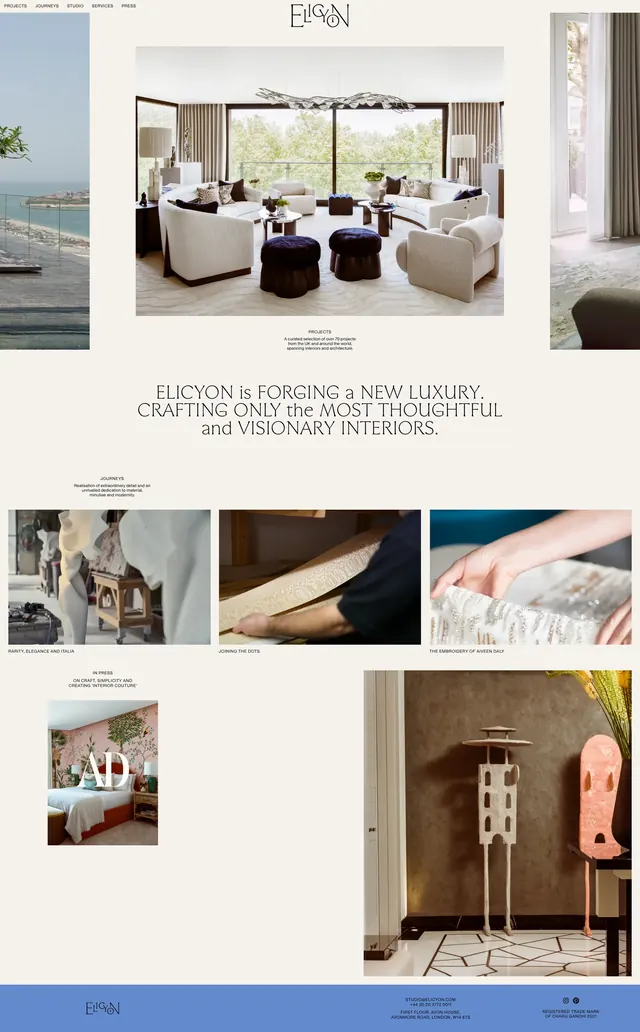
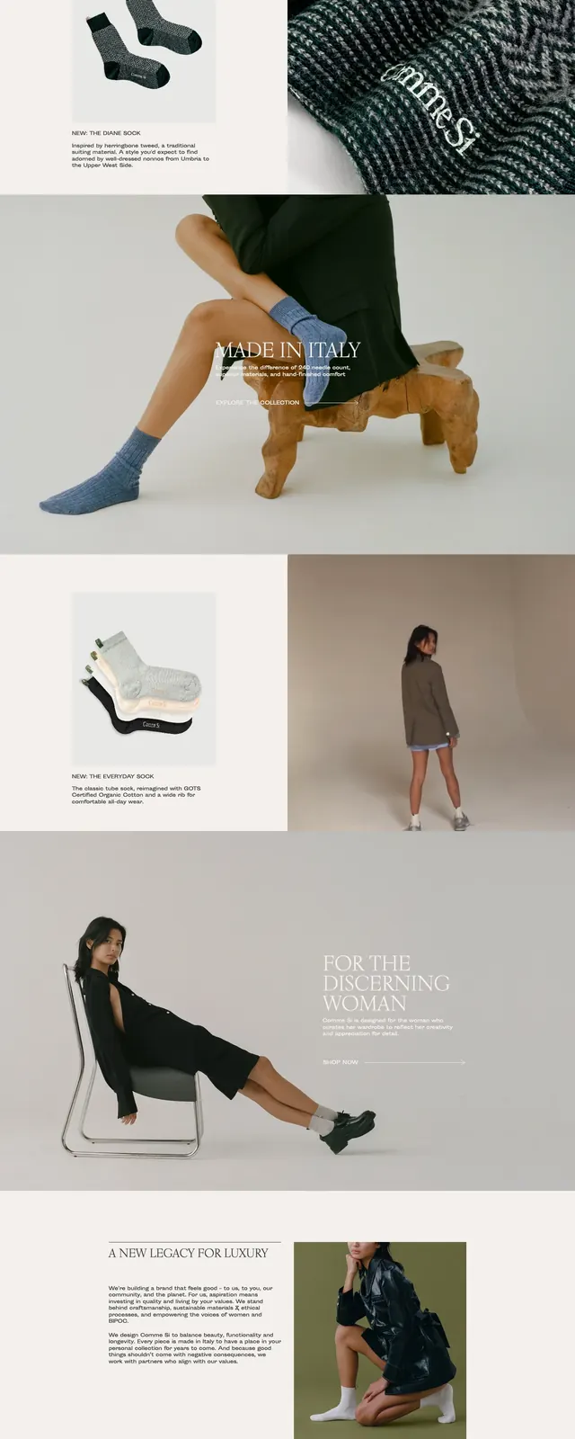
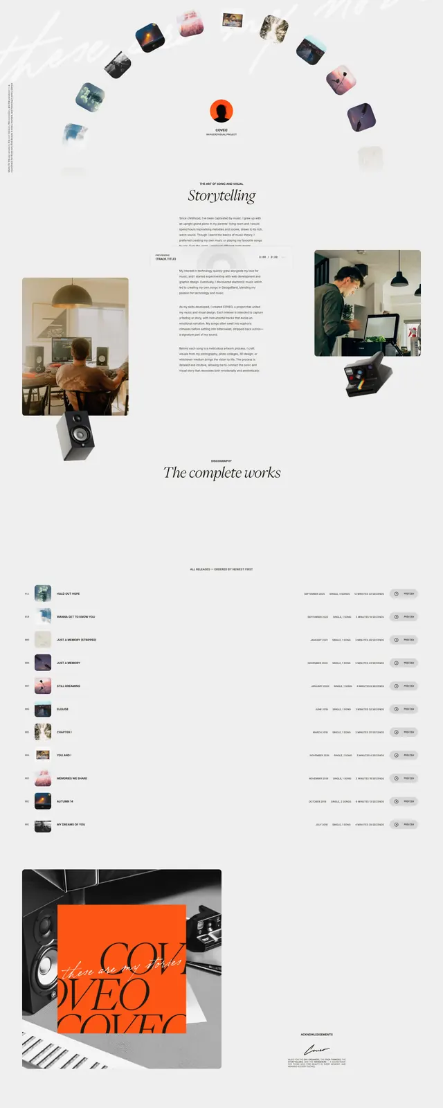
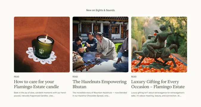
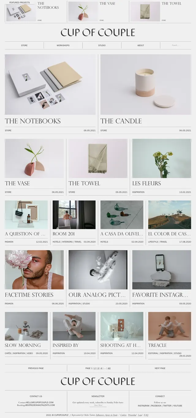
A soft minimalist editorial homepage with a refined magazine-style grid, slim dividers, and fashion-lifestyle image cards.
Summary
A soft minimalist editorial homepage with a refined magazine-style grid, slim dividers, and fashion-lifestyle image cards.
Visual description
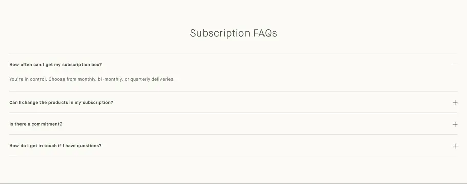
The page uses a pale neutral background with fine horizontal rules, centered branding, and elegant serif headings. The content is organized into stacked editorial slices featuring large image cards, smaller teaser grids, and repeated post listings with category labels and dates. Navigation is minimal and understated, with a search field and simple top and footer link rows. The overall look is airy, curated, and print-inspired.
Key takeaway
The design feels like a luxury magazine homepage translated into a calm digital grid. It is strongest as an image-first editorial layout with restrained typography and very light chrome.
Reuse notes
Reuse the thin divider system, centered masthead, and repeated card hierarchy for a refined blog or lifestyle portfolio. The palette and spacing work well for brands that want a quiet, high-end presentation without heavy UI elements.